Free Style in 2.0
Annouille 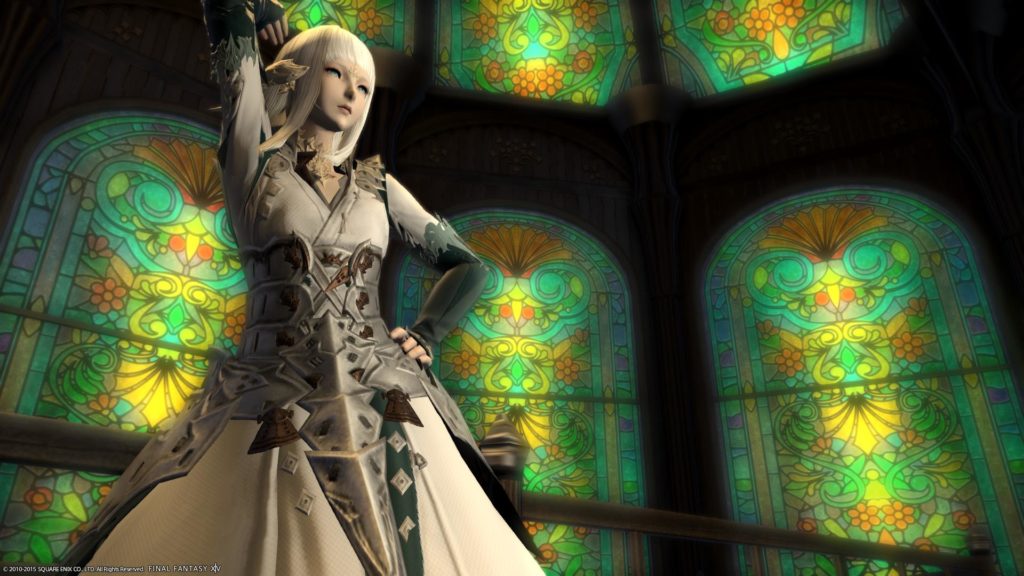
Eldaena 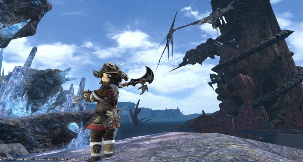
Iris 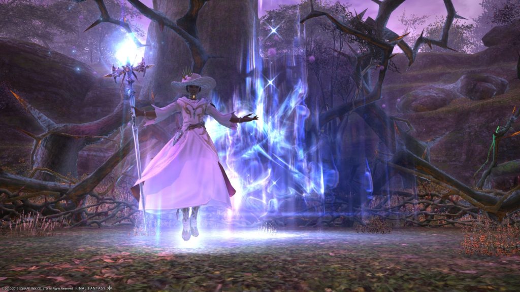
Katarh 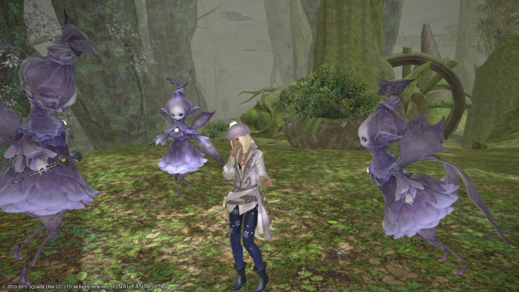
Kipih 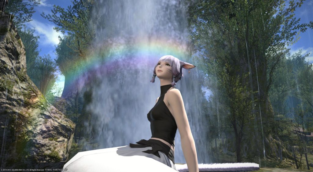
Kitori 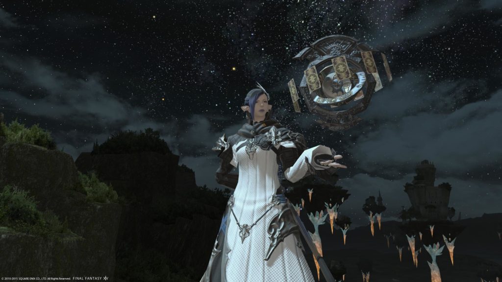
Rivienne 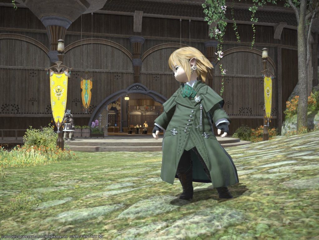
Stephen 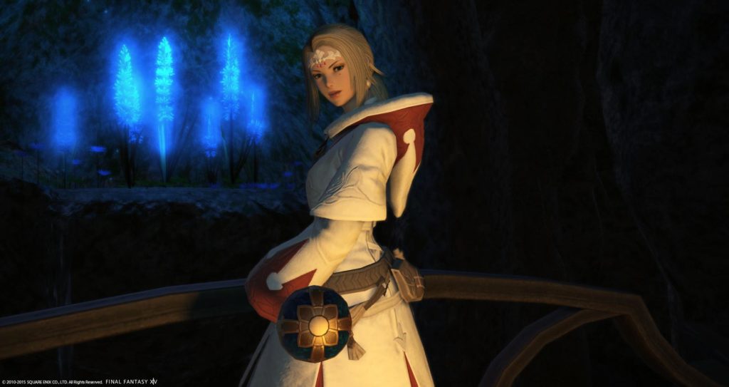
Tress 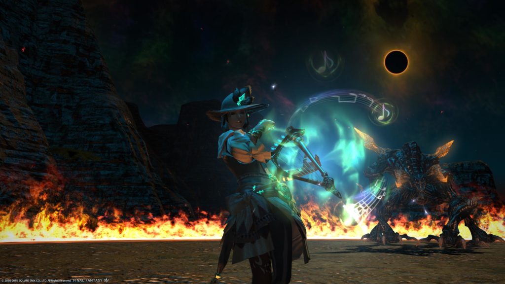
Velora 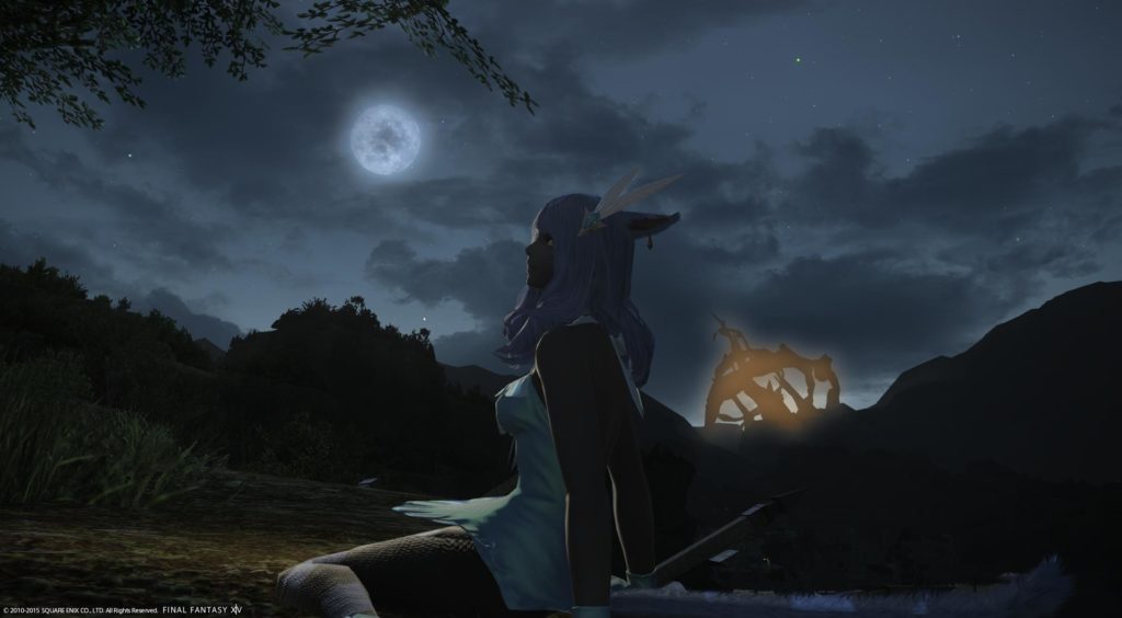
Xelah
Round 1 Judge’s Critiqes
Ciara’s Critiques:
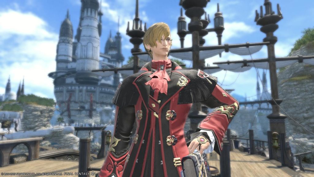
Annouille Andouillant (6 points):
Ahh a good ol’ Lominsian boy! Maelstrom all the way! I love the outfit you chose for this picture. Using the colors of the Maelstrom and your pose looks to be proud of your home nation. Gpose is proving to be a great tool and I can’t wait to see how you and the others use this. I don’t have any real criticism for this shot though I suppose if I had to give any I’d prefer you to be a bit more to the side. It’s not enough to lose any points in my book though as you filled the background wonderfully.
Eldaena Vonxandria (11 points):
“Take a look at me Gridania! I mirror your elegance.” Is what this shot says to me. The gpose effect is soft and really makes your shot pull off the fragile, beautiful you and the background give off. Lovely shot.
Iris Dawnshade (10 points):
Pictures like this remind me that great strength can come in small packages. You have the look of nostalgia and bravery, of the strength of the people. The color is lovely and I quite enjoy how it stands out in this setting yet blends so nicely.
Katarh Mest (2 points):
I’m happy to see someone use the thorny portion of the shroud with such a whitemage feel. Your outfit is very lovely to suit your role though I would have liked to seen this shot angled a little less to the floor or closer in. Casting times are spot on to give you a lovely magic feel without being overly flashy. Good job!
Kipih Lanbatal (1 point):
Ballsy girl making conversation with dark sylphs! I do hope we haven’t seen you tempered! It’s a very cute shot though I wish I could have seen you a bit clearer. Though Christmas is in the air I feel the pants didnt quite match up with your shot, though I still feel you did a lovely job.
Kitori Orihara (8 points):
This picture is super cute. So happy, the rainbow mirrors your sunny side. lightnings great, outfits cute. and I like the touch of the waterfall. “The more you know” even played in my head.
Rivienne Cotrlaint (4 points):
Like Xelah you’re rockin’ that moonlight look about you. Your pose and facial expression def give me the feel of what you were going for with a interesting reading. Though not really a compaint I feel like your head blends in more then the rest of you with your background if that makes sense? I wouldn’t use it as a complaint or to dock you points though. Lovely work.
Stephen Fairbrook (3 points):
Though I don’t want to give you the wrong impression with so many other models looking in different directions to me it looks like your almost looking at something or someone just off screen I wish I could see. Your cocky outlook is quite refreshing though.
Tress Amell (5 points):
Respect for the healing arts both in glamour and in background. I like the coloring in this shot a great deal. Then again im also a sucker for those blue lights. Though this picture is lovely I know that later many voters look to award the points to shots that tell a great deal of story. though I won’t hold it against your shot some might. Always try to sell the shot<3
Velora Hunter (7 points):
Having always been a fan of the primal rounds Im glad to see someone play around with Ifrit again. The way the shots put out, with the added context makes me feel like you could be the bard, weaving a story of illusion behind you with out imagination. Very nice shot.
Xelah Jakkya (9 points):
Though some shots like this that only stick to a few shares can come off a bit bland you actually did a great job making them work together. I especially like the small splash of orange to change it up. Lovely job on the midnight lighting and representing that of a seeker of the moon. I wish you could have been a bit more to the right of the shot for the angle of looking at the moon but once again, I don’t feel id dock points for this.
Nozomi’s Critiques:
Annouille Andouillant (11 points):
This shot has such an optimistic and at home feel! You did a great job conveying your Lominsan pride and showing why 2.0 areas are still amazing. One small nitpick might be the far left’s vague emptiness but the distant spires and deck railing fill it in enough that it can be almost totally ignored. The outfit seems fitting and works well with the background; its bright red had the potential to stand out too much but the lighting washed it out just enough to firmly put you in your environment. Placing the blue sky behind Annie’s head was a good idea here. Fond smile is nice. I wonder if you had made this off-center with Annie more to the left if it could have been even better? The use of /gpose blur made this shot work.
Eldaena Vonxandria (10 points):
Lovely showcasing of a 2.0 location. You expertly handled this very strong background not letting it overpower Eldaena at all. You managed to restrain it so that It really adds atmosphere that echoes what we’re shown with your character. The distant gaze, ethereal combo of pale hair, skin, horns, and robes, gentle sway of the sidebangs, and graceful pose with the background really combine to form a shot that knows what it’s trying to convey. Perfect light placement pushes you to the front without shoving you out of the scene. Nice use of the default green in that healing robe.
Iris Dawnshade (7 points):
I think the concept and item choices were good here but overall the shot could still be refined. The obvious polygons and odd texture on the ground diminish the beautiful detail elsewhere in the shot and the placement of elements in the picture feel like they should be adjusted a little more left or right to better frame Iris. I don’t know if it was something you did on purpose, putting red in your outfit and having red in the background, but the slightly different tones just sort of clash. Your character’s whole palette is actually more saturated than the background so it sort of ends up making you look like a sticker placed on a scenic shot. Also, this doesn’t really highlight you, that could be any Lalafell standing there.
Katarh Mest (4 points):
A lovely palette here that communicates a living evil and magic. I really wish you had moved Katarh to the right so that she was surrounded by the blue light because right now it just looks like you’re standing next to a glowy thing. Your outfit choice isn’t too bad but the hat throws the look into Costa territory a bit much for me. You used the very aggressive term “banish” in your description so I think it could have been nice to see a less passive, floaty pose. Ignoring that though you create a nice contrast with your pure appearance and the twisted, dangerous briar. Offcenter was fine for this but with the banishing evil thing a strong centered shot may have been the better choice. Perhaps a powerful shot looking up at you surrounded by magic and thorny briars would have been good.
Kipih Lanbatal (3 points):
Your outfit choice is confusing me; the top half looks like you’re kind of trying to look like the sylphs but then we take a left turn at your hips by throwing in a deep blue found nowhere else in the shot, dark black boots, and snowflakes. Are you joking around with the Sylphs? The Sylph placement seems like I should really like it but something is off; if the picture was flipped perhaps. It feels a bit left side heavy. This shot could have benefitted from moving the camera lower and making Kipih a bit bigger. The Sylphs are so lovely they almost steal the show. The shot feels a bit simple.
Kitori Orihara (1 point):
That outfit looks really great on Kitori and even though it doesn’t seem to have anything to do with the background it doesn’t really feel out of place. My biggest problem with this is the bland, empty right third part of the shot. Off-center would have worked here. I get the joke but I’m not sure that’s enough to have gone with this shot. Your smile matches the rainbow and upbeat feeling of the pic.
Rivienne Cotrlaint (5 points):
I almost missed your puzzled expression at first! The left half of this shot is very empty; just rotating the camera around Rivienne a bit could have really improved it. Be careful about standing out too much from your background; having more of the crystal carrots framing her would have balanced the robe’s brightness out. Having the beautiful milkyway stars in the shot was a logical but great move for playing up the Astrologian plot. Nice concept.
Stephen Fairbrook (8 points):
I totally get what you were going for but some tweaks could strengthen the shot a lot. I assume you used /lockon? Rotating Stephen further to the right so that his head and either the Gridanian flag or the Adventurer’s Guild hit rule of thirds sweet spots and lifting the camera a bit for a start. Currently the ground is edging too close to covering half the background where only a third would have likely worked a bit better. The colors in this shot are doing odd things. That yellow is practically glowing and the washed out skin on your face sadly makes you look a bit …dead. Great outfit choice! An even tighter zoom on Stephen might have worked.
Tress Amell (6 points):
Lovely outfit and beautiful lighting; feels like a cg cutscene. The dead space on the right really weakens the shot unfortunately, making everything feel crammed into the left half. And off center shot or getting something else in the background would have worked. Lovely lady you have there by the way. What is the big circle by your hand? I love the way it handles the light but it seems a bit out of place. If it’s a weapon, turning a little so that we could see more of it might help.
Velora Hunter (9 points):
Great original concept! I love the almost neon colors contrasting with the dark, brooding hues throughout the shot. Biggest complaint is the dead left half although I don’t totally hate it here because I can see this shot as part of a moving scene in my head where you’re panning over the shot of Ifrit in his arena and there is one little floating red spark with the rising flame curling up. Putting Velora off to the left might not have hurt. Could have been difficult to time but possibly having her open her mouth would add to the storytelling aspect.
Xelah Jakkya (7 points):
Nice outfit choice for the description, I really like the tilt of the scene as it almost gives the shot that off-balance feeling from dreamscapes. It would have been a good idea to block the glowing orange crystals with your body or something because right now they really draw the eye. Letting that branch dip into the shot was a smart move; it frames your picture beautifully. Using the sun minion to give the impression of moonlight was smart and the slightly warm light it cast on the ground actually strengthened your shot because of the subtle increase in the range of hues present.
Xev’s Critiques
Annouille Andouillant (6 points):
Someone must have told Annouille my secret: I’m a total sucker for tall, well-dressed Elezen. Especially the ones that make great mastheads look small in their presence. This portrait makes great use of contrasting warm and cool colors with the red gear against a blue sky. The soft blur of the /gpose is also a nice touch. Without it, those towering masts might overwhelm the picture. With it however, it puts the focus right where it needs to be: Elezen handsomeness.
Eldaena Vonxandria (10 points):
Unlike those movies where an evil doll comes to life and starts stabbing people, Eldaena shows us that not all dolls are truly evil. Looking like a marble sculpture come to life, she sits to the side of the stained glass rather than on top of it. It works well in making the eyes dance between the shiny glass and her beautiful character. While twirling into some glorious lighting, the background has enough shadows to add contrast and depth. The only suggestion I could possibly think of, and only because I have to, is that she might crack that stony expression with a smile. Then again, all those evil, knife-wielding dolls had creepy smiles. So on second thought, nix the smiles
Iris Dawnshade (11 points):
Behold, a fierce warrior potato toting her small axe into battle to show the rest of us fools how it’s done. I am awash with both awe and hunger looking at this shot. Personally I like my potatoes with butter and salt. However, I will admit Iris standing tall ( for a Lalafell standards) in opposition to that vast blue sky is also mighty good. The framing and use of reds against blue really makes the colors pop in this shot. Even though the tower holds more rusty hues than direct red, it still takes center stage alongside the warrior gear. Between the silhouettes of the axe and the winding, tower rubble, we get these interesting shapes that play with shadow and light that satiates our visual palette; even if we’re left with a hankering for potatoes.
Katarh Mest (3 points):
Girl, you moon prism power your way to victory and don’t let any evil Moogles from the negaverse try to stop you! That floating white dress, the spell-casting and the shimmering exit combine nicely to create the perfect magical girl moment. This is a beautiful concept topped off with a graceful gown. Despite having really cute shoes, and those shoes are ridiculously adorable, I would have liked the camera to pull closer so we could see more of your characters face. Ain’t nobody wants to see an evil pit of Moogle doom when we can gaze on your characters loveliness instead.
Kipih Lanbatal (1 point):
If the purple cabbages ever wondered why they lacked friends, they need look no further than this shot. Our daring hero has taken the time to dress in the Sylphs signature color in a fine show of solidarity. And how do those cloying collards thank her? By flying willy nilly across her screenshot casting their unsavory spells. Where is the gratitude? Lettuce show those violet vegetables where they really belong! Use them for their leafy framing and pull the camera in on the true star. A tighter framed shot would also give us a better glimpse into Kipih’s expression to show us how she really feels about those loathsome lettuce-heads.
Kitori Orihara (8 points):
When I was a kid, someone told me there was a magical pot of gold at the end of a rainbow. So one fateful day, I decided to follow one to see if there truly was some untold treasure at the rainbow’s end. Alas when I found the end, there was only a dilapidated bus stop with a homeless man beating the hell out of an old trash can. I can say with all certainty, the treasure at the end of this rainbow is considerably better. This is a very well-lit shot and Kitori looks uttery adorable staged in the center. The waterfall droplets on the right combined with the perfectly positioned rainbow pull the entire piece together and make it something almost magical. My suggestion for this is to give us MORE rainbow (GIVE US ALL THE RAINBOWS!!!) because can you really get too much rainbow in a shot?
Rivienne Cotrlaint (2 points):
Scientists have yet to determine the reason the floating isles continue to defy gravity. Some theorize it’s due to an imbalance in the natural aethers in the atmosphere. Others speculate that it has something to do with the crystals growing in the roots. I say it’s due to the overwhelming blast of Elezen gorgeousness that is radiating from this screenshot. Rivienne’s star shines the brightest against an entire galaxy of stars in this shot. It’s a beautiful concept and the star globe compliments it perfectly. I do wish she took a step to the left of the screen so that we got a more interesting view of the glowing isles behind. This is also a shot that would have benefited from either a sun minion or different time of night for better illumination of our lovely model’s face. After all, if you are fierce enough to dominate the stars with your steely glares, we need to be able to see it.
Stephen Fairbrook (9 points):
If you happen to be in Gridania and witness the sun bursting free of the clouds to cast radiant beams of light towards the canopy, don’t panic. It isn’t some divine intervention or apocalypse from above, but our own local tater, Stephen Fairbrook, taking a casual stroll through the gardens. Seen here looking pensive as his gaze wanders off to the Twin Adder’s crest, Stephen seems at ease in this bright, happy shot. You can even see that slight pull of a smile as surely he knows how insanely adorable this picture is. When it comes to suggestions for improvement, I have but two: First, is that he might have worn another color besides green to stand in better contrast to the grass. Second, that he signs on as a spokesman for herbal teas across the world. They would make millions over night with this sunny image alone.
Tress Amell (5 points):
Filmmakers across the world still debate over the use of orange to blue gradients used to colorize modern films. While some reject it as an overused trend, orange and blue is still the most widely used color grading in the motion picture industry. When these colors are combined, the orange warms up flesh tones making it’s subjects pop against blue low-lights. This screenshot is an excellent example in how these opposing colors can make each other glow. Tress looks warm and serene standing against a backdrop of pale blue flowers and darkness. The lighting in this scene is also fantastic in it’s contrast. The only suggestion I could offer up would be to have Tress take a step to the right to kill that empty space behind her.
Velora Hunter (4 points):
As a self-admitted cosmetics connoisseur, I can appreciate the time and dedication that goes into this lip gloss game. Your lip gloss truly be poppin’ here. The question however, is does Ifrit notice it? Does he appreciate the subtle highlights framing your character’s perfect lips? When was the last time he even LISTENED to those sparkling ballads you’ve poured from the heart? To hell with Ifrit. It’s high time he went to the back of the shot where he belongs! He can sit in the corner alone and reflect on the many screenshots he has burned before. Bring that camera in close to your character for the people who appreciate real beauty. That dazzling, glazed lighting is doing wonders for your complexion and the world needs to see it. If we were to position your character to the far side of the screen, it would also cover the dead space on the left while letting those bright teals of your spell effect shine more dramatically against the dark.
Xelah Jakkya (7 points):
The only thing better than one cat staring pensively at the moon, would have to be three. Either that or a random keyboard thrown somewhere in the mix. I love the use of the sun minion to cast extra light to mimic moonbeams. It completes the effect that our fair feline is out for a night of peaceful moon bathing beneath the stars. One of the details I like most about this shot is the fact it looks like it was taken near a valley. The terrain in the background seems to curl up towards the edges giving it that spherical panorama effect. All in all, the only thing I could suggest would be getting a wee more light on the foreground so we can relish in all the delicious details of this comely kitty cat.