Round 1 Theme: Ugly Pretty
Winner: Caimura Rathe and #Team Ty
Critiques
Marik
Caimura Rathe of Balmung:
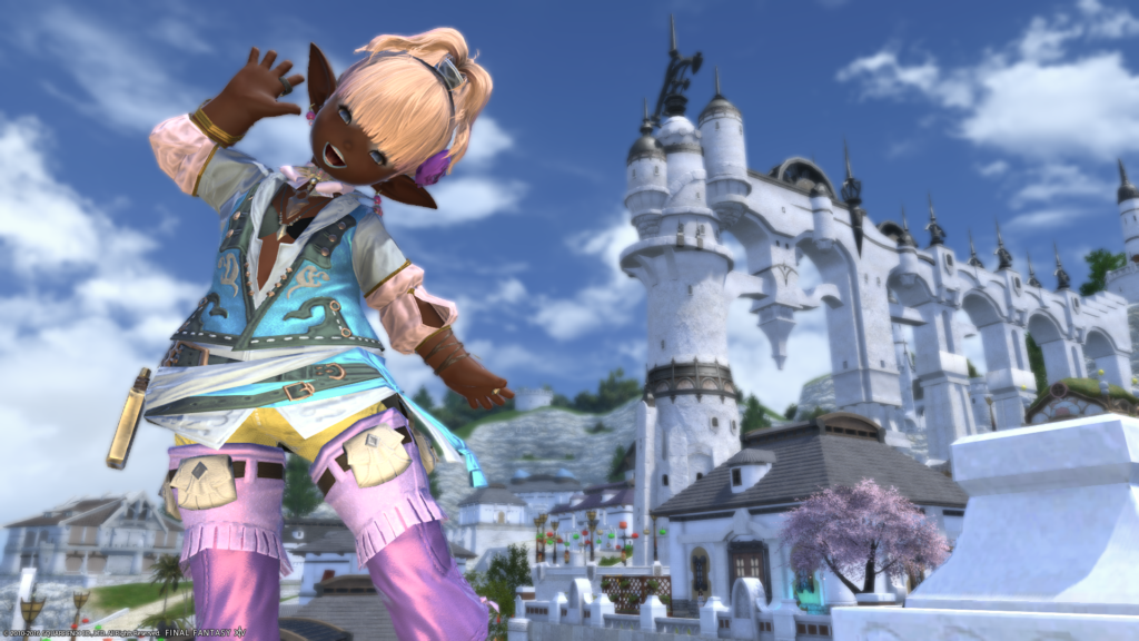
First off I want to say, wow! You really know how to do “ugly” well! I won’t lie; this is probably one of my top favorite picks of this challenge. Your character just beautifully pops right off the screen with your background. Your metallic color choice helps bring your character to life against your background as well as the light metallic against your dark skin helps soooo much! I absolutely adore your posing; your lighting is on point. Every little intricate detail I’m in love with, from the purple flower in your light hair, or the bright blue lipstick against your dark skin! I will say this though be careful of your background though. If it wasn’t for the metallic colors and it would have been the same colors but non-metallic, then you would have easily blended in to your background and scenery and you as a model must always pop and stand out. Good job all round, I can’t wait to see what else you bring to the competition!
Katarh Mest of Lamia:
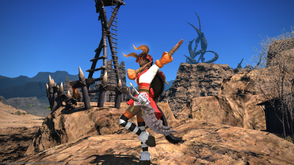
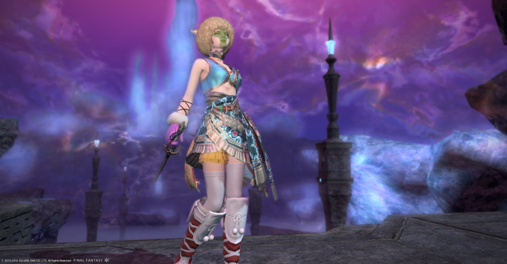
Hmmm, your shot gives me vibes of Midsummer night meets Dante’s Inferno lol. I’m not sure I’m a big fan of covering your face and especially for this particular challenge. I love your outfit as a whole because it’s extremely on point with your vision, and I’m in love with your fashion show for the Amal’jaa! Ifrit never looked more beautiful! The reindeer hooves with the kimono and stockings are just AMAZING! You’re background is definitely on point as well. My real main nitpick and concern is your angle, it just isn’t very complimentary for the pose you are using as well as your outfit. I would have loved it from a facing the camera perspective more or even a more severe angle with a little bit more of a close up. Overall just good job, love the glamour choice as a whole, background, and your theme! Here is to seeing you turning up the heat even more come next rounds!
Kimberlynne Highwind of Malboro:
What a way to start off the competition! Such a sassy pose, I can tell you have a lot of personality, and look forward to see more of that sassy-ness. I really enjoy your outfit as a whole, I’m not sure I would have picked those colors in particular though, they blend too well with your skin tones and don’t pop as well as they could have been. The fashion itself is definitely on point, definitely “ugly” but be aware of your colors and hope they don’t blend in too well with your scenery and you yourself, mainly the pink on the vest. I like the background, but your lighting on yourself it a bit dark, I’d love to have seen more sunlight or the sun minion on you to make you shine more so we could see the “repulsiveness” that is this challenge lol. Over all good job, love the sass! I can’t wait to see even more of it!
Lior Xanthos of Gilgamesh:
Such gracefulness and ugliness! Your posing is everything, and your fashion is just “dreadfully atrocious”! All of that in the ugliness of the category lol, glamour is on point as well as your scenery and area of choice. I love the mishmash of colors as well as the bright pop of your character’s body and glamour against your background and scenery. Just be careful with your skin tone and the sky, it’s not an issue now but could be the less you would wear, just make sure not to blend in with your background ever. Always shine bright and be a star! Overall love it, wonderful choice of background, glamour, and graceful posing!
Poppy Milkweed of Cactuar:
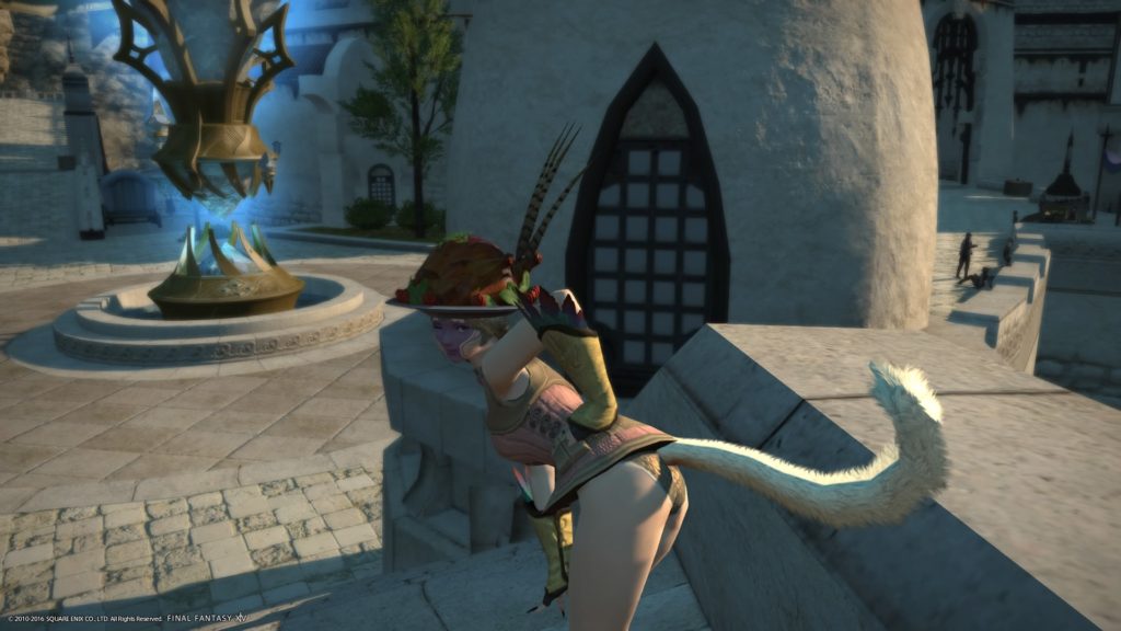
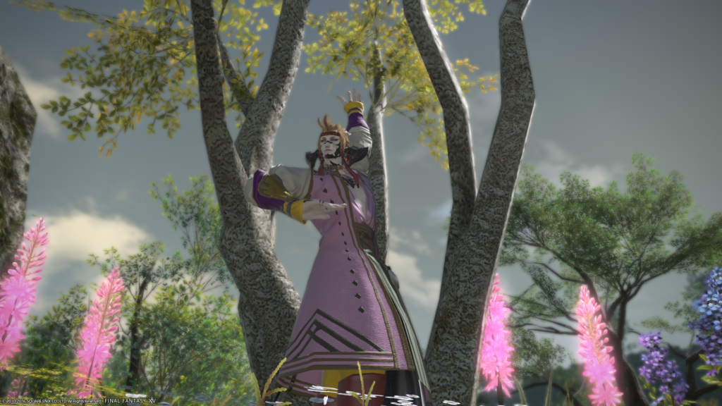
What an explosion! Very nice show of what is going on in Eorzea as we speak tying it into your photoshoot! Your background is so beautiful and you really pop with your color scheme and choices! I absolutely adore your pose; it’s very cute and very model-esque. My only concern is the covering of your face, in your subtitle it read “It’s for the best that you can’t see her face…” and to me, that screams “Wow! What could possibly be under there that is so ugly? I want to see it now!” I feel it was a safe choice, but let’s face it… the tin can is one of the ugliest armors possible in this game and I applaud you for taking advantage of its ugly and using it to your advantage. Just make sure from time to time we get to see your face, sometimes face can really help make or break a good shoot! Overall though very good color schemes, great use of a trash can armor, and LOVE your gorgeous background!
Sangriah Valere of Excalibur:
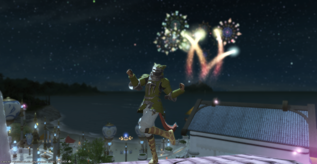
What an interesting hodgepodge of eclectic gear! I’m thoroughly impressed with your thoroughness of ugly! You rock that Egg helm, and I find it ‘eggs’cellent!… (Oh no bad egg puns!) I feel like you get this whole vibe of “I rock this beautiful egg eleganza!” while Yellow Moon over there is going “Gurl… get that hideous atrocity away from my beautiful Roe self!” Just so dynamic, you pop out just right; lighting is so on point, a very well put together shot. My one thing would be just be careful of your color scheming when coordinating with friends or NPC’s it could have easily been Yellow Moon upstaging you, but you definitely pulled off the yellow look much better!
Flare
Caimura Rathe: I really enjoyed your photo a lot! While I was drawn to your gloriously horrid outfit, it works well with the stunning background and actually makes the metallic of the colors more annoying, but of course in a good way! This was one of my favorites this week. Nice work!
Katarh Mest: While the mismatched outfit and accessories were put together very nicely, the outfit follows the same color scheme a little much for me. The ranger pose fits well with the Amal’jaa theme you were going for, the background feels bigger than it should with some emptiness.
Kimberlynne Highwind: You definitely make a crazy looking outfit look sexy. Props on that! I would have love to have seen a variety of different colors, but it works with the background. One thing I would work on would be the lighting, Use the sun minion to bring the color out on your face and that outfit.
Lior Xanthos: As one of the only males in this competition, you’ve produced a strong photo for the first week. The background looks nice with the outfit and the pose ties in with that. Lighting is a little dark but it works somewhat since the sky in the background is overcast.
Poppy Milkweed: This is actually one of my favorite backgrounds from these batch of photos, very nice job with that! I felt like the outfit wasn’t particularly ugly or pretty. Just something I would have seen if I ran a low level roulette.
Sangriah Valere: Pretty night sky with the Vesper Bay building in the background. You have a smug look on your face which makes you look pretty sassy. However, like before I feel like this is something I would see in a low level dungeon and wouldn’t think anything of it.
Masha
Bastien Felicieux of Balmung
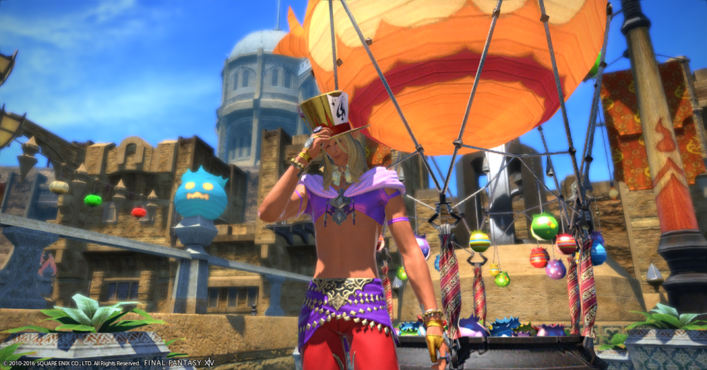
This is definitely one of the more vibrant entries and the colours of your outfit certainly play well into the display behind you. The almost garish colours certainly are cringeworthy (especially because I have a personal dislike for the metallic colours). However, I am a bit unhappy with your pose and background. I think you could have afforded to zoom a bit more out, which would not cut off the bombard balloon as much as it does right and the half cut off streetlamps on the left would not catch my eye as much as they do right now. The pose is a bit worrisome, since it reads “exasperated” to me and almost makes it look like you don’t want to show your face, pretty much casting the only large shadow in this vibrant picture onto yourself.
Gangly Zilla of Cactuar
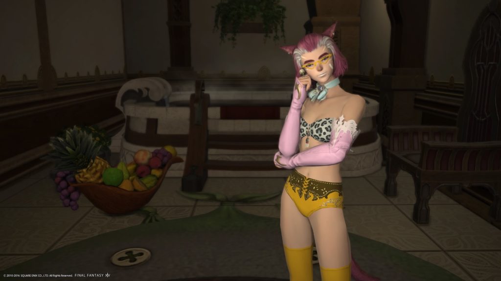
What struck me in this first was the lighting. You manage to set yourself perfectly apart from the rest of the picture, automatically drawing the eye to yourself. Pose and outfit are great, though I am on the fence about the lip colour. I had to zoom and squint a bit to tell if you were smiling or looking bored, because the lips blend so much into your face. The background sets a nice scene, but seems very basic. Might be my own history with baths, but I think you could have gone a bit more to town on the decorations to make it more inviting even.
Iris Dawnshade of Hyperion
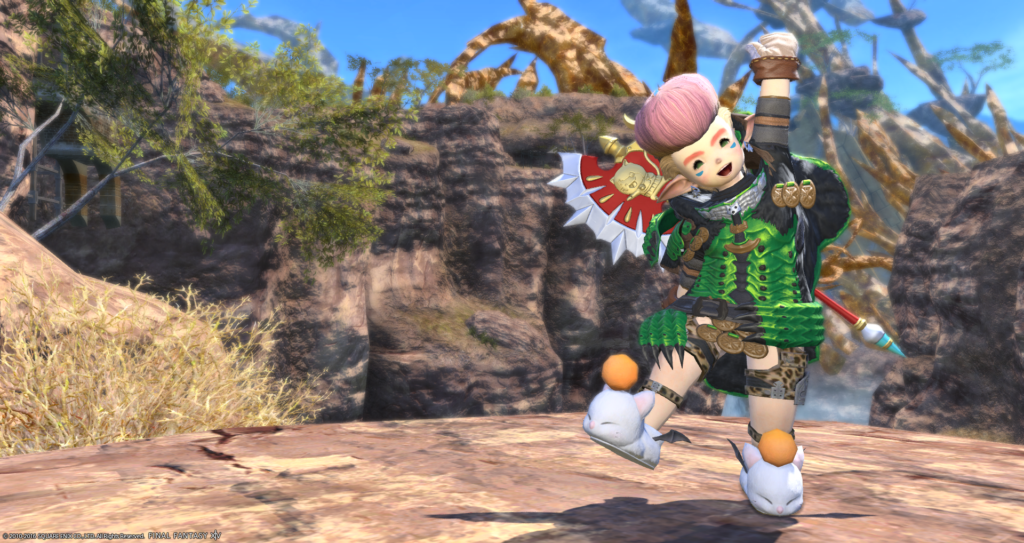
Wonderfully cringey outfit (and hair, oh god) and a very vibrant way of presenting it seemingly without a care in the world. You get bonus points from me by choosing one of my favourite locations in Eorzea, the Burning Wall. What dragged this down a bit for me is the fact that you are covering up the pretty part of the scenery on the right with yourself. The left is rather drab with just a bit of foliage and a rock, especially against vibrant you. I feel the picture could be more balanced if you had positioned yourself left.
Jester Ehrenfeld of Balmung
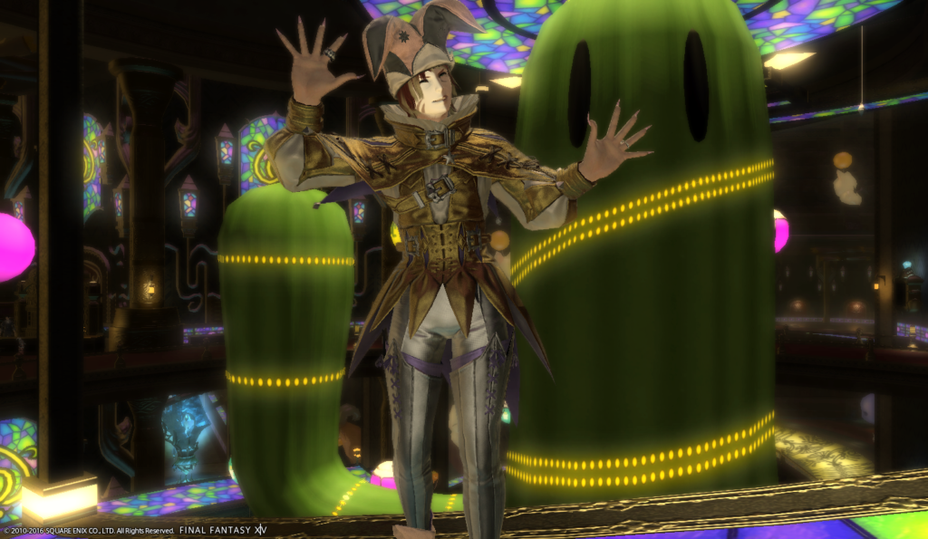
I REALLY like the play you did on your name with this outfit. Thinking about it, it might be a bit less cringy because of it, but I think the setup just sells the picture so well. Your pose, too, reminds me of a pantomime, so it works very well into the overall theme. The location works well into the theme, though I think you could have zoomed out a little more. Additionally, to that, by default the location is rather cluttered and can easily draw attention away from you. The cactuar eyes for example feel weirdly distracting. I do like though that your right arm kind of mimics the cactuar’s.
Mackayla Lane of Balmung
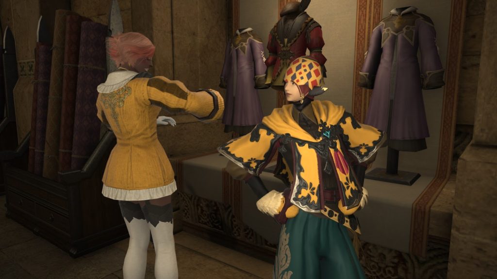
I love the pose, the extra and the setup! They are absolutely great and you have that snobby “I know I can pull this off” look on your face! Sadly, I feel some impact is lost by the composition. The entire frame could be shifted to the left somewhat, because your extra is cut off, and instead we have a bit of empty space / random Lala in the back. A slight zoom out would also give us the full glory of your hat. Lastly, the lighting is great to set you in scene, but with the extra light of your glove that area washes out somewhat while at the same time drawing more attention to itself than, say, your face.
Nadede Lasalle of Hyperion
There is an odd kind of serenity in your pose and the colours of your background. A little bit more zoom out to see your feet and maybe more of Crystal Tower would make it ideal, but certainly you sell the look on both pose and background alone.
What put me off a little is a closer look at your eyes, there is a very odd line there which makes me think you were maybe about to open your eyes? It’s one of those minor-but-cannot-be-unseen-moments that made the end result suffer a bit in my eyes. The smallest details can sometimes draw the eye the most.
Shayera Tano of Faerie
My trouble with this was that more than an Ugly Pretty theme, I was reminded of the “Match an NPC” theme from a past cycle. True, that NPC’s colour choices are rather cringe worthy, but there is certainly worse and it feels less original than a lot of the other entries. The lighting is well done, making sure you’re not overshadowed by the night, but at the same time I question, why night at all? Sorry, I felt this shot a bit past the objective.
Eldaena
Mackayla Lane – Yours was my number 1 this week. You used your lightning, posing, and location to your benefit. I like that you weren’t completely center. I wish the hat wasn’t cut off, but the cut off at the knee looks fine here. It also amuses me that the guy on the left seems to be presenting you as his newest masterpiece of sorts and you have that great spot light on you to reflect this. Looking forward to future shots!
Nadede Lasalle – Yours was my number 2 this week. Your lighting was great, pose was good, and location was beautiful. You look very serene, but I also couldn’t think of why your character would be at this location and holding a dagger like this. The cut off at the feet is a bit distracting, though I know it’s difficult to get a full body shot. Can’t wait to see more!
Gangly Zilla – Nice to see you modeling again, Gangly! You were just above the middle of the pack for me this week. I like your lighting and posing. You seem to almost be trying to mimic the bowl of fruit to left with your outfit. I feel like your background is a bit dark and I couldn’t find much synergy other than maybe you’re a rich person lounging around your extravagant home? =p Looking forward to next week!
Bastien Felicieux – Such a colorful picture! I liked your, “I’m just too cool” pose here. I think your outfit would have benefited with a more exaggerated top. I would have also liked to see the camera panned down a bit more, since the cut off above the knee distracted me. I was imagining you’re some kind of gambling salesman? Maybe selling those bombs with a chance to win big! I’m ~betting~ on seeing you next week!
Iris Dawnshade – Nice to see you again, Iris! Your pose is super cute here! I like how I can see all of your body, the lighting is good, and your background is pretty. And while I like your pose/outfit/lighting, I didn’t feel there was enough within the shot to really grab my interest. It could be that, in contrast to your wild outfit, the background really lets you down instead of supporting the shot. Either way, looking forward to your next picture!
Jester Ehrenfeld – Pretty neat with your name and outfit tie in! I originally had you rated higher, but after some evaluating, I had to lower you a bit because I realized I actually just liked your outfit too much. It didn’t make me cringe, so it probably wasn’t ugly enough. (Sad as I am to say that.) I also think you could have benefited from better angles in your shot. Gold saucer was a good idea and I like your pose too. However, I don’t feel like you’re rocking it enough and you I think you needed a bit better lighting. I really hope to see great things from you next time!
Shayera Tano – I’m not sure about the outfit, but I will say, your face is super cringey in this for me! lol Your starry background and dim lighting are nice, but I’m unsure as to who you are looking at here. I also feel like because your npc is much larger than you, she grabs more attention (even with her sleepy eye look.) Also, because you’re sitting and having your legs cut off by the shot, there is much less of you to see. I think better angles, posing, and some different concepts of shot composing will help you with future pictures.
