Round 4 Theme: New Zones New Tribes
Winner: Nicol Grunenberg

Critiques
Rongi:
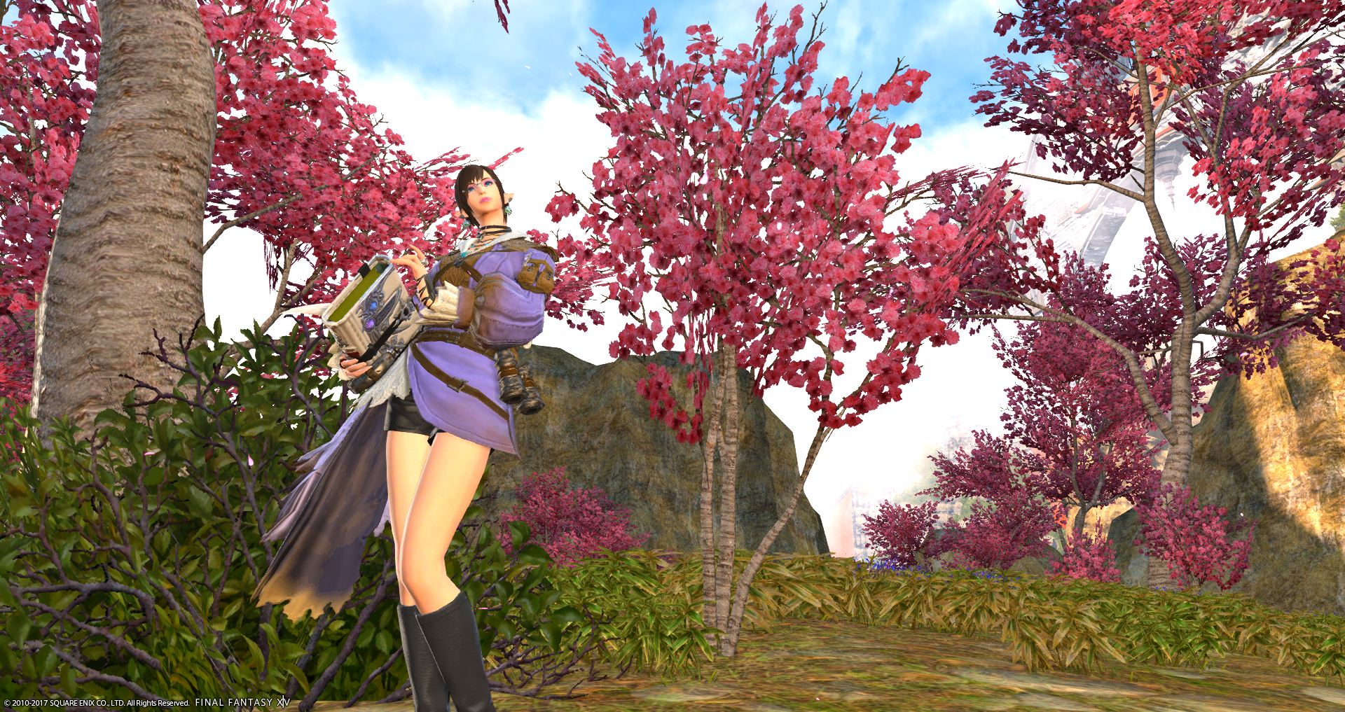
Nicol: Hey Nicol, welcome to Round 4! Last week, I really enjoyed your shot! The browns and the dark blue, plus the placement of you and your partner were done really well. If I can get nit-picky, I would have liked it if you moved the camera down just a tiny bit, so that the NPC behind you’s feet weren’t cut off at such an awkward place. But other than that, I liked it and appreciated the simplicity. This week is another great shot from you as well. It is risky to do a back shot, but this worked in your favor. I like the over-all composition, the two layers we get in the front and the back, and the big open sky is great. I wonder what it would have looked like a little bit more zoomed in, just so you aren’t being overtaken by all that background, but I like this shot as well. My advice for you next week is to really look at your zooming, and try and find the perfect amount of zoom in that will please all the judges. I know it’s hard, haha, but keep trying! Good luck!
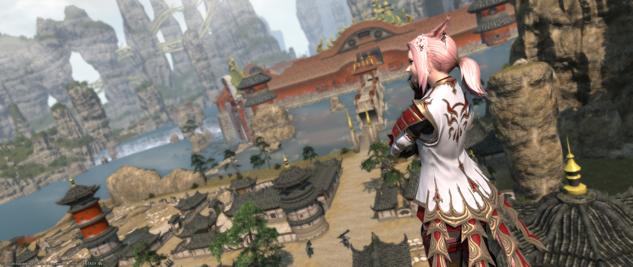
M’telihgo: M’telihgo!! I am so proud of you this week! Last week, I was, again, disappointed by your background and foreground composition. It is cut off at the top of the building in an odd area, and I think your partner would have looked better completely in frame instead of half cut off. Your glamour also left me with something to be desired. But I saw you in the discord chat asking for advice, and I heard that you got some from a previous winner. I don’t know exactly what she told you, but you submitted the best image of you so far, this week! Look at that image!! It’s beautiful! You are off to one side, you’ve got a tilt going that makes the image more interesting, you’ve got a nice Asian glamour to match the Asian scenery, the fade from white clouds in the corner to dark rocks in the opposite side give the image a nice flow…it’s great. I am so proud, and I hope you see as well what an improvement this is! You are in my top 2 this week! I am just blown away by how much you improved in just ONE week! Congratulations! I cannot wait to see what you bring next week. My advice this week? Keep. It. Up!!! Good luck!!!
Zetsumei: Welcome to Round 4 Zetsumei! Let’s start with last week’s photo! Amazing. Everything about it was amazing. The composition, the framing, the effects, the glamour’s, just perfect. One of my favorite pictures in ENTM history. Congratulations. This week’s shot is quite impressive as well, but I feel like it’s a small step back for you. The effects, the glamour, the mount, all the pieces are there, but your background composition was lackluster compared to previous weeks. I love this picture but I wish you hadn’t been dead center OR that the background had some sort of rhyme or reason to why it is there. Maybe something is behind you that made this background choice your number 1 pick, I just can’t see it because of your position. But this is by no means a weak picture. It’s just hard to go from your Round 3 shot to this shot. Seriously, last week was AMAZING. My advice for you next week is to simply keep on doing good. Watch those backgrounds! I wanna see something like your Kugane post card shot and your Double Trouble shot every week! Good luck!!
Katarh:
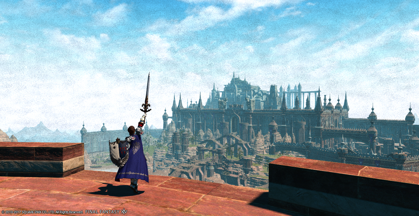
Nicol Grunenberg: This is by far my favorite shot from you yet. This looks like a Renaissance painting. I love it so much! Fantastic usage of the location – good weather (I like the contrast of the partly cloudy sky against the castle) and good decision to make the location itself the primary focus. Following the rule of thirds, my eye is immediately drawn to your character, and to the castle, and the triumph that is radiating out of that fierce pose. The only tiny suggestion I can think of is zooming in just a hair more to cut off the excess ledge near the bottom, but that also might have been tough to do and keep the whole castle in view. Overall great job!
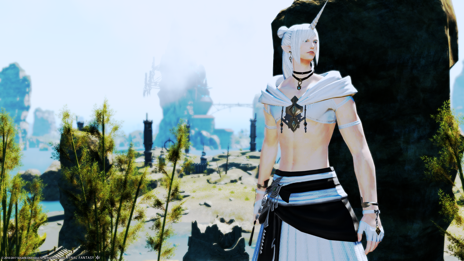
M’telihgo Feilyon: An excellent shot this week from you as well. The concept is great and your execution is excellent – you look very pensive overlooking the ruins. I would have liked to see just a bit more of your face, though – getting the three quarters turn and still looking out over the vista might have been tough, so perhaps a slightly tighter zoom might have achieved it as well.
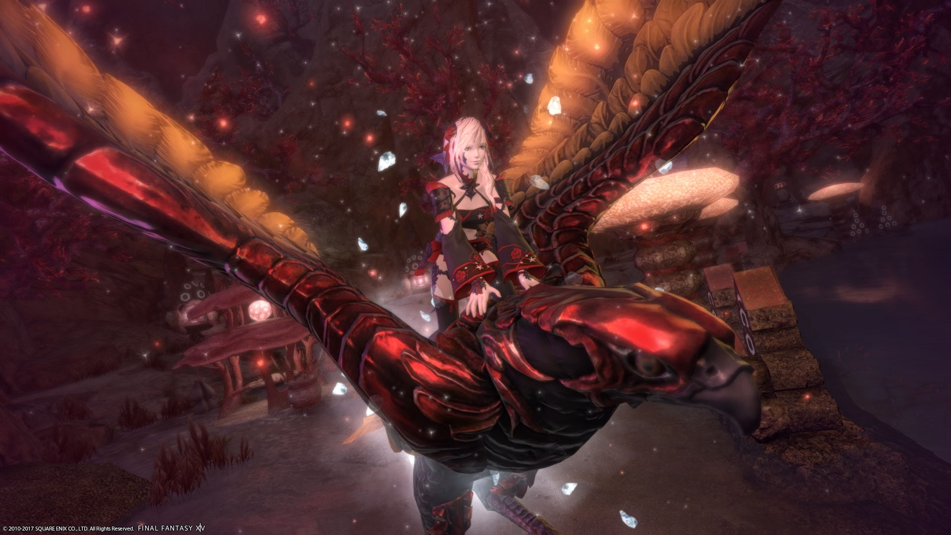
Zetsumei Tsunarashi: This shot is quite lovely, but I think this week might have been the week where “less is more” should have been your guiding thought. Yes, it’s Kojin of the Red…. but everything is so red I can barely see the location behind your bird! I think you have some limbal darkening in red, and that along with the zoom being too tight on your character means the location itself, which should have been the star of the shot, has been washed out. I do like your choice of glamour for this (since it comes from the zone’s dungeons – and has red!) and your choice of mount to emphasis the red theme.
Nadede:
Destiney Delvanguard: Destiny, this is probably one of my favorite shots from you thus far. The place that you picked to read your book is one that I would pick for myself personally. While I like the image you have taken I wish that I was able to see your feet as well as it feels a bit odd having your feet cut off. While I like the idea of having the sakura effect in your image, I wish that you could see a bit more of the effect as it is barely visible. I encourage you to keep listening to critiques that are being said, not only for yourself but for others as well. I also would encourage you to keep playing around with your lighting some more and with limb darkening. The limb darkening will help with drawing viewer’s eyes to you. This is really a big improvement over your image last week. Keep it up!
Gangly Zilla: Gangly, I normally love what you come up with week after week, I feel as if you stepped a bit back this week. Your glamour I feel goes well with the atmosphere of the area that you are in and the expression on your face does have the look of being very cautious as one would be in a new area unknown to them. The tilt also helps give that feel of uneasiness. I feel that the effect filter used detracts from your image. I am wondering if perhaps another choice of filter effect or color filter would have been a better choice that could convey the dreamlike state you are going for. Last week’s image I liked the lighting used and how you had your hand outstretched was inviting the viewer to join you and your companion in a scary realm. I can’t wait to see what you come up with next week.
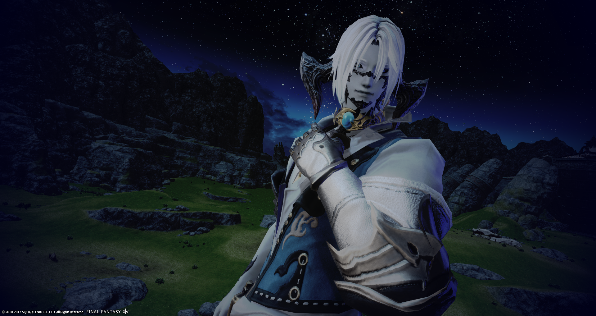
Leviathan Seagreen: So, are you happy to be back in your homeland finally after I’m sure has been a very long time? I like how with your hair and skin tone being light along with the lighter colors in your glamour makes you pop out against the night sky. I also how the lighting makes the image have a softness to it and the use of the limb darkening helps draws viewers in. While there are things that I do like about the image I wish that you could see more of the Au’ra villages in the background. You are from that area, be proud of it and show more of it ? I also liked your image from last week as well. The only detractor I could find from that was that you were dressed in a dark attire while your companion was dressed in white. You just want to make sure that if you have another in your shot that they don’t try to take the spotlight off of you. Keep up the good work and looking forward to what you come up with for next week.
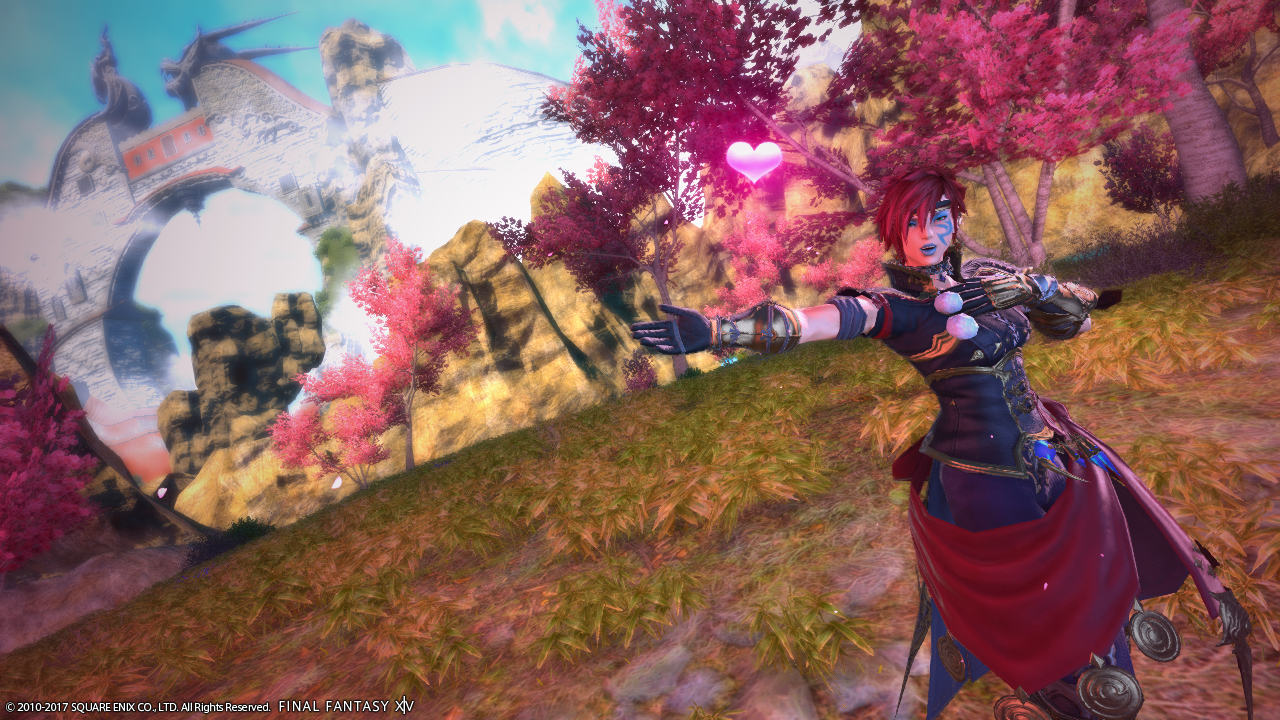
Linmei Quan: Linmei, you have been improving week after week. The colors within your glamour goes with the colors within the background to give a cohesiveness to your image. While I like the lighting in the background of your shot, I wish that you played around with the lighting closer to you to help you pop out some more. I am also finding that the heart in your image and your feet cut off a bit of a distraction. Maybe having you zoomed out to just where your toes touch the edge of the image would have been a better choice? Your shots appear to have the same mood, color tone, etc week after week. I challenge you to try to blow me out of the water with your next set of images and to come out of your comfort zone by changing something up, be it your style of glamour, hairdo, lip color, maybe no tattoo, etc. Don’t be afraid to ask past judges and contestants for advice. Now, can you be up for the challenge given? Hmmmm. Can’t wait to see if you will or not! 😀
Samuru Lantis: Such a contrast with this week’s image compared to the one last week (which btw I liked). I liked how it took the past critiques and used them to help improve your images. While your background is very bright I liked how you used the dark rock to help make you pop out against the background. The colored marker filter also helps bring the plant life around you pop out as well. While I like your image and the lighting in the background works with the overall image, I just wish I could see what is in the background a bit more. Play around with the limb darkening and see if it will help bring your character out more. Keep up the good work and looking forward to next week.
Vaughn:
Destiney Delvanguard – This! This is what I’ve been waiting for from you! One of the most gorgeous models finally bringing her game up! The overall image is one I could see in a fairy tale. Bright colors, blue sky, white clouds, and a distant image of a castle? (I know it’s not, but run with me here!) You chose a color for yourself that compliments the entire image while making you stand out, refusing to let you blend into the dream. Everybody better watch out for you in the upcoming weeks!
Gangly Zilla – I look at this picture and see Alan Wake. Dusty, misty, desaturation with a tiny glow in the distance. You must also enjoy horror games! Strong camera tilt adds to the overall nightmare setup of the image. I’m almost scared of what’s going to pop out at us!
Leviathan Seagreen – I have yet to be disappointed by any of your shots, and this is no exception! While the background is dark, you can still see the little details, and that sky is phenomenal! With you in the forefront, shirt the same color as the sky, it brings the whole image together. Bravo!
Linmei Quan – Keeping up with the strong images! The depth of field and tinted limb darkening really help make you pop! Great use of the camera tilt as well. Not too little and not too much, just enough to give this shot dynamic. If there is one criticism, it’s your hair blends into the trees a bit. However, it does’t distract too much. Keep this up!
Samuru Lantis – Ahh, this is the Samuru I expect! Placing yourself against the darkest part of the scene is the best choice, and I’m glad you did it while still setting a bit against the background to tie the contrast together. This is definitely a serene image, and I know I’d like to be meditating while staring off into that misty distance with you!