Round 1 Theme: Minion Madness
Winner: Rivienne Cotrlaint
Critiques
Flare:
Rivienne Cotrlaint:
I love the dynamic between you and the dragon minion. It looks like you have a real bond, and your telling me a story.
Noesis Phobos:
The humor in this picture is spot on! I’m in love with the simple colors, the color filter really makes the white background pop.
Doki Kodoki:
Watch out, someone’s about to be in trouble! The contrast of this picture is super gorgeous.
Stephen
Fairbrook: You did well picking that color filter. The pose you’re doing with page 63 keeps us focused on you.
Nadede Lasalle:
Just another night with the goblins! You look like you and your little guy belongs there.
WoW Wie:
Very nice background, pose and use of the dragon minion.
Kusuh Valentione:
Nice tone and setting. Looks like you and your little buddy are taking a break from studying after a long night.
Gangly:
Wow Wie
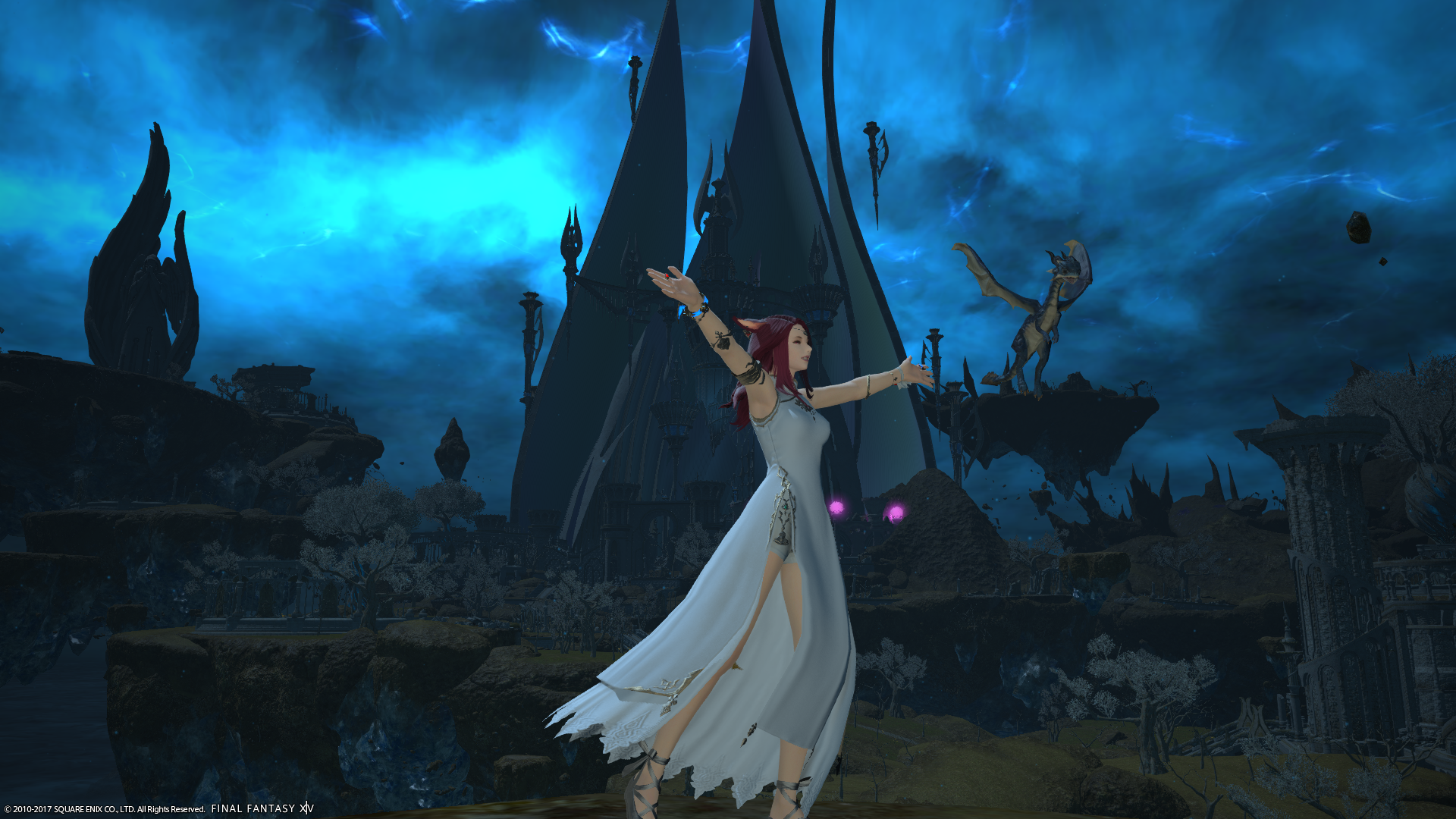
Rain or shine, a teacher must serve as a role model to the student! Choosing such intense weather for the story being told gives your shot an extra layer of uniqueness, and the way your dress is flowing allows me to imagine the gusty winds blowing through. The shot is well-lit with natural light and the white of your dress helps you stand out! However, I find that the camera is rather far from you, and that little Ohl Deeh is blending into the background due to the darker colors. I think to exaggerate the impression of flying, zooming in much more and tilting your camera up towards the sky would help with that, but would also serve to narrow the area of focus on you and Ohl Deeh (also the awesome weather effects)! I do get a sense of a patient and enthusiastic mentor just with your emote!
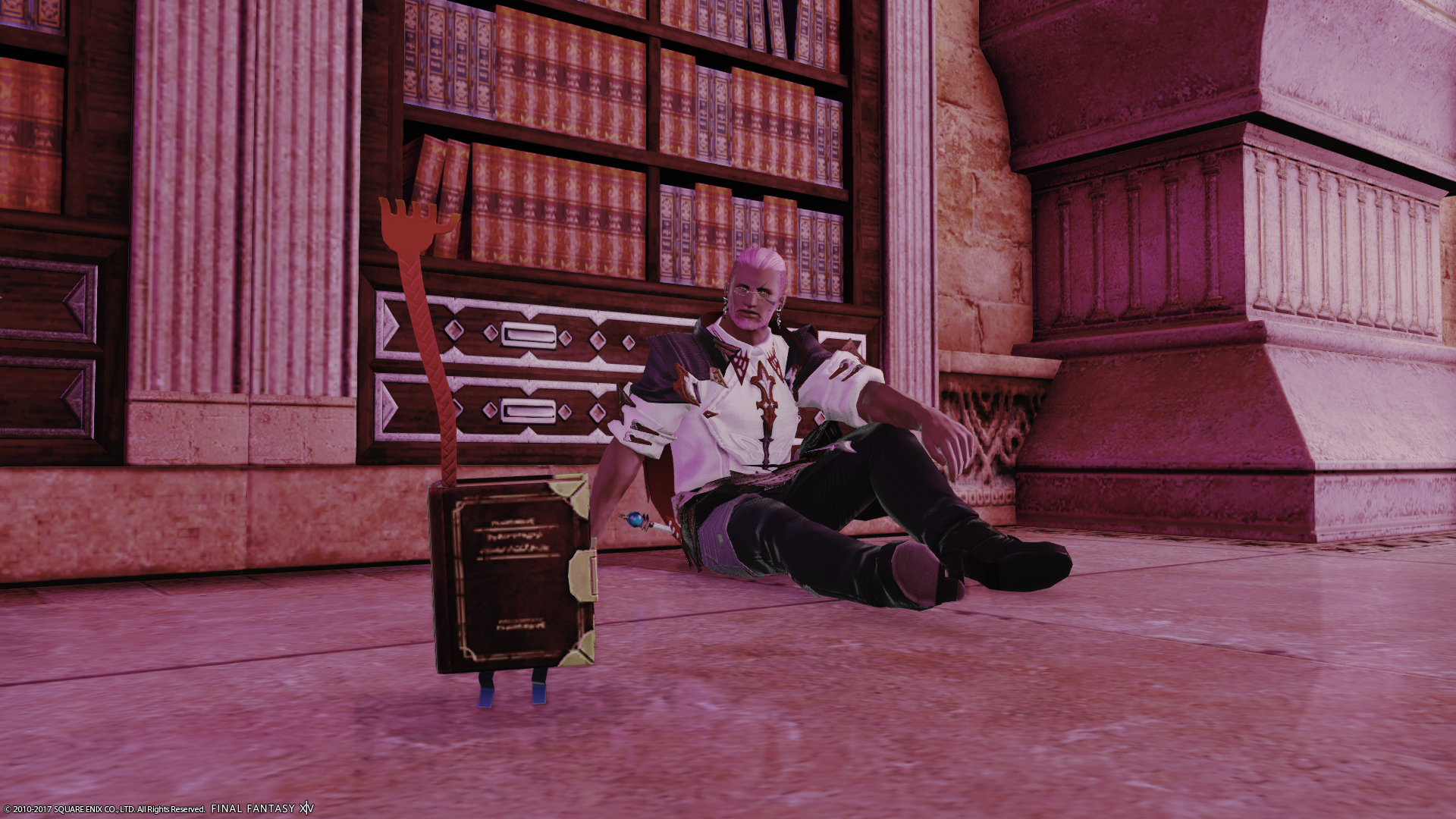
Stephen Fairbrook
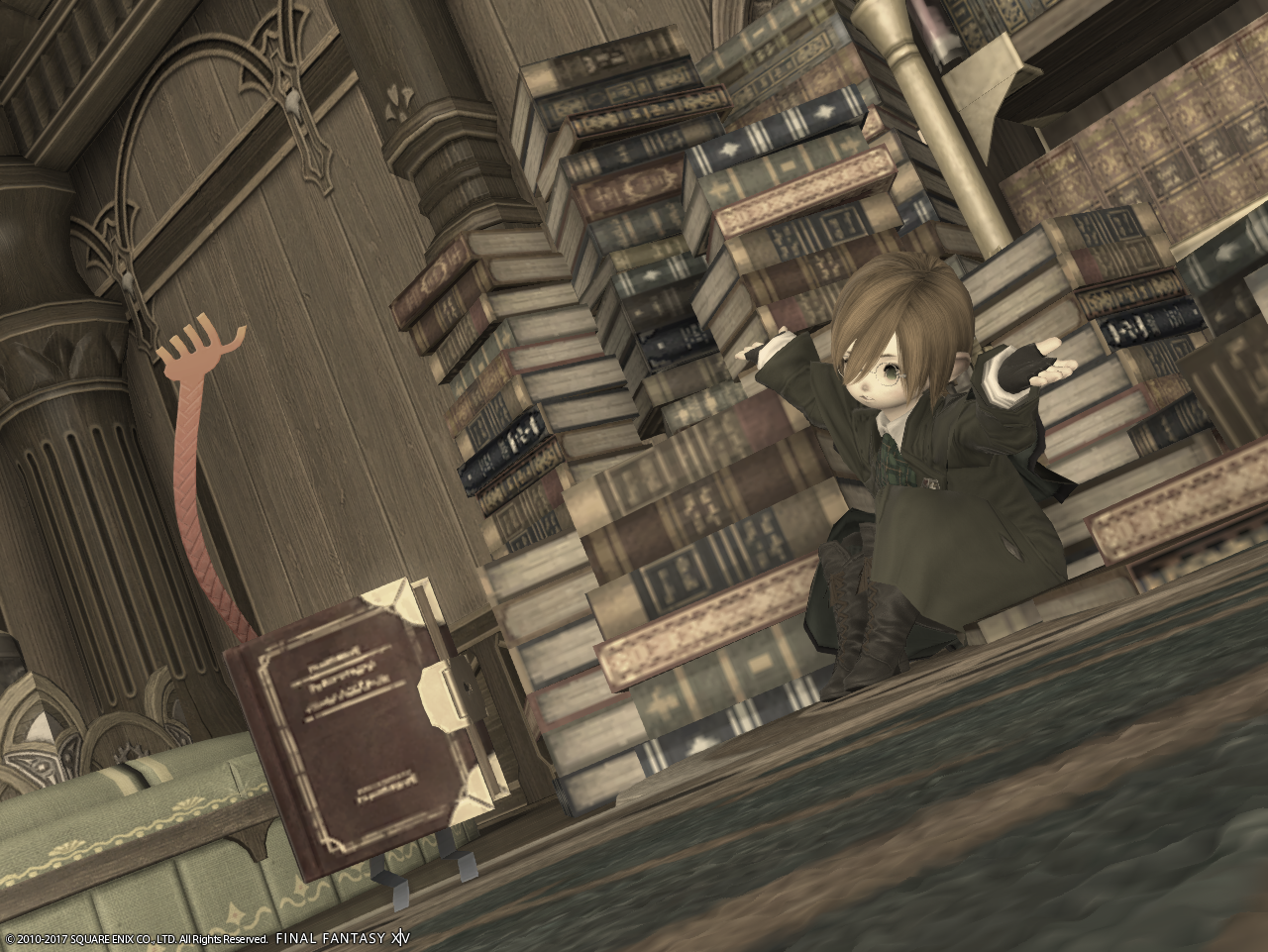
I’m loving the scholarly feel from this shot! The piled books behind you, your outfit, and the filter used mesh cohesively to create that. The filter works extremely well with the greens and browns, giving your shot an older feel to it. While the background shows me your studious side, your interaction with your minion shows me a more relaxed side! The camera tilt works quite well with your scene, but I feel the angle from which it was shot could have been pushed just a bit more. The camera can become distorted with varying angles, and I think having your minion even closer to the viewer could manipulate that distortion to create a unique sense of depth!
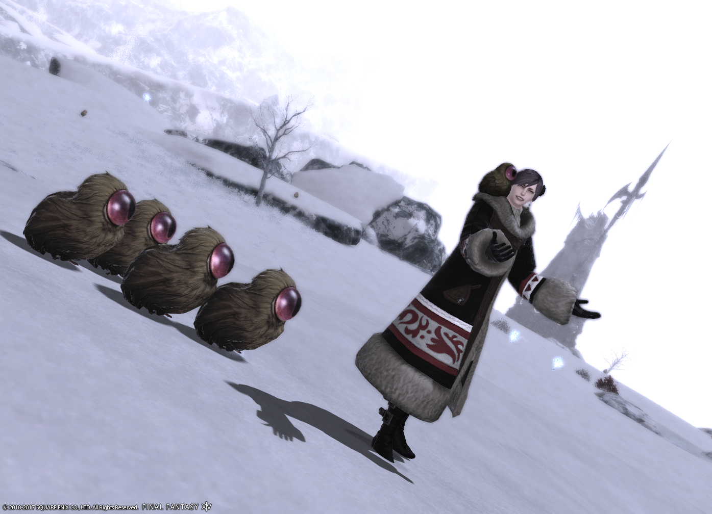
Noesis Phobos
This is an adorable shot! The darker colors of your outfit and the Shalloweyes make you stand out clearly against the white of the snow and the sky. Your expression is warm and friendly; no wonder your little friends adore you! The slight tilt of their heads looking up at you reminds me of little ducklings, and the smaller one on your shoulder conveys a much closer relationship than what might have been had they all been following you. I am not quite sure if the camera tilt works with this shot; using no tilt to show the flat plane of snow in the background could add a more natural scenic element to the picture, but also parallel how straight you are standing. Aside from the emote, the camera tilt does create an illusion of walking downhill!
Rivienne Cotrlaint
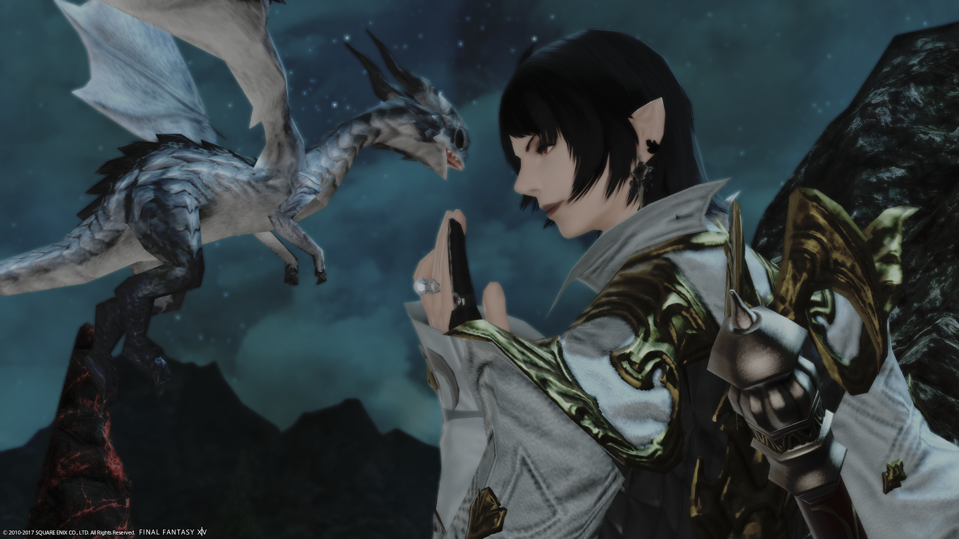
The emote your character is displaying matches so well with Ohl Deeh’s toothy little grin! I get the feeling that you both are looking to start some mischief! The proximity between you and Ohl Deeh further accentuates the comradery between the both of you. Even the wings on your outfit mimic that of Ohl Deeh’s! The deep black of your hair contrasts heavily with your fair skin, making you pop out against the background, however, the back of your staff in the corner is somewhat distracting, not only because I see very little of it, but because it is the closest to the viewer. I think using a one-handed staff/wand would work just as well, and not detract from the emote which already conveys your shot’s mood!
Kusuh Valentione
This is very calming to look at! The soft pink of the whole shot and the bit of light coming in from the right gives the background a serene feel. Ahhhh, what’s better than sitting by a bookshelf and having your minion grab a book for you? I really do love the background and how you’re sitting against the bookshelf, but I’m not quite sure what story is being told. Your outfit led me to interpret your shot as a battle-hardened scholar taking some time to sit down and relax with a good book, but the lack of emotion on your face makes it a bit confusing. A little smile, a side glance, maybe even a grin could give me a hint as to how you’re feeling in your shot! (It’s ok to laugh at me if I completely misinterpreted that!) Your minion’s distance from the bookshelf creates a fun illusion of its arm being long and flexible, as if reaching into the back.
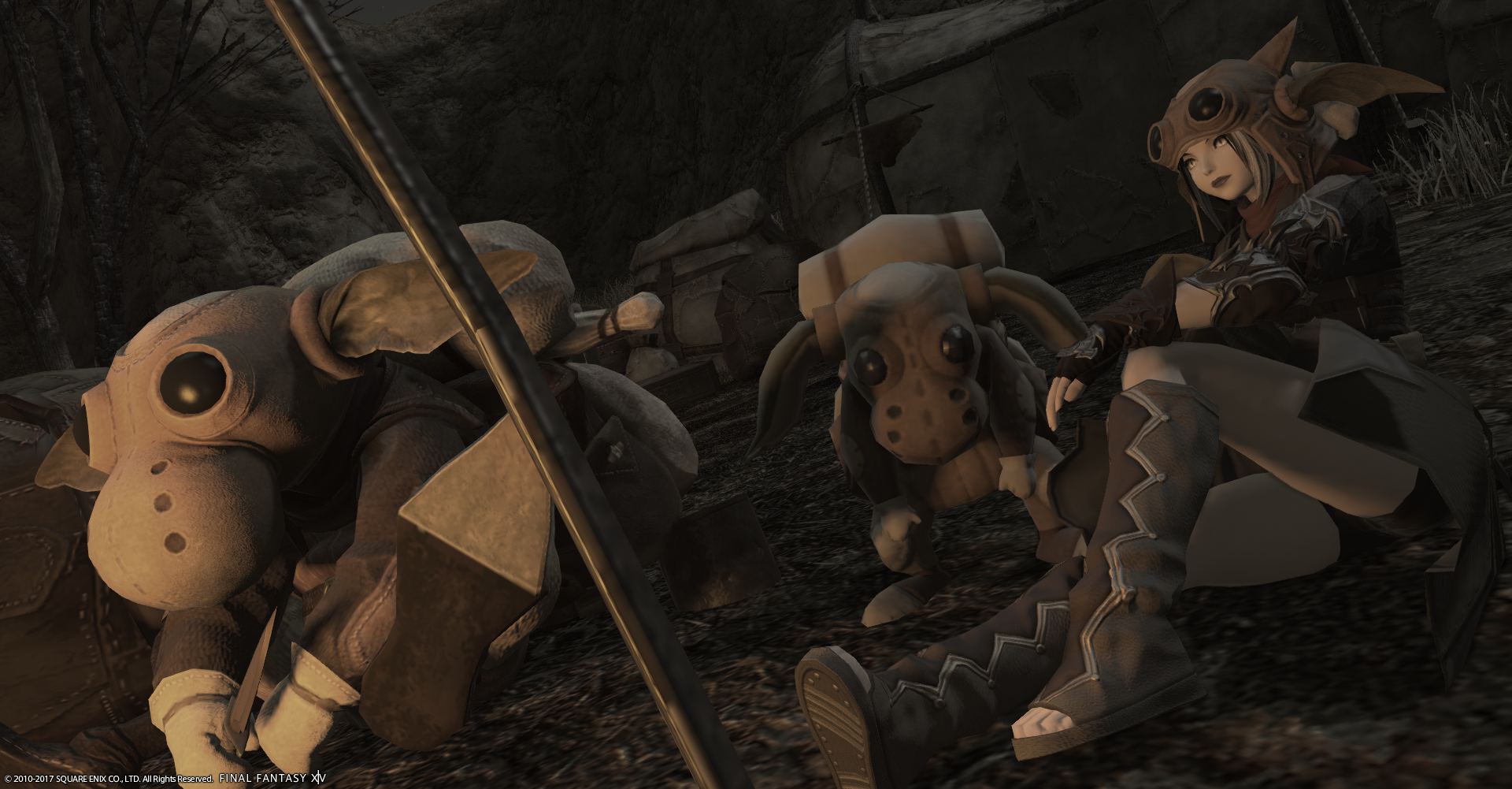
Nadede Lasalle
What a cool bunch! Your outfit shows a rougher exterior which matches perfectly with your gobbie friends. I really like how you are facing in the same direction as the left-most gobbie and that the light hits you both in a similar fashion; you are both the same, yet different! While I am curious as to what your shot would look like if your minion was facing in the same direction, I think the small deviation makes your friend seem a little shy! I am not sure if it is the tilt of the camera or if you are sitting on uneven ground, but your sitting position looks a little odd; the front of your leg makes me think that you are sitting flat on the ground, but the rest of your body looks as if you’re leaning on your side. I think lessening the tilt of the camera and swinging the camera closer to yourself could alleviate some of that. I also usually try to avoid having any foreground objects in my shots, but I think the metal part in your shot creates an interesting divide!
Doki Kodoki
The lighting in this shot is great! The summer vibes are coming through clearly, and with a unique twist! The emotes displayed give off a worried and cautious mood, but the location, weather, and camera tilt keep it playful! The calamari looks as if it is facing your character, drawing my eye towards you. Your guest closest to you does take some of my attention away from you because of how much light is shining on her back, as well as her being very close to the center of the image, but the distance between you and your guests in the back make it easy to identify that you and the troublesome calamari are the focus!
Katarh
DISCLAIMER: Everyone did an amazing job this week and nobody had a bad shot. Choosing the order for these was hard. My critiques are my own personal preferences, so take everything with a grain of salt.
Doki + Calamari + Bright 1
This is an excellent use of the filter to emphasize the atmosphere – bright, playful, cheery, and innocent. (Well, except for Calamari, the only minion less innocent than Succubus.) Your faintly terrified expression brings this composition together, and I especially like how the bottom of Calamari is cut off, so that the rest of him could be lurking just below the bottom edge. I think your screen shot tells the most complete story this week. The one thing that would have made this better is if your friend’s … um… bum…. was not quite so dead center. Controlling extras is hard!
Rivenne + Dragonet + Pastel 2
I love that you chose a head shot for this so you could put the focus on you and the Dragonet. Although the background isn’t a big part of the composition, it’s clear enough that it’s Dravania, and the atmosphere with the stars in the sky is a good complement to the setup. The position of your hand makes it look like you’re about to tickle him under the chin. This is my favorite this week and I can’t think of anything else you could have done to make it even better. Great job!
Nadede + Gobbie + Echo
Gobbies think brown tint is goodsight! This picture feels really cozy, and your gobbie cosplay is spot on. I’m wary of having the “odd angle for the sake of an odd angle” in the new /gpose, but in this case, it works since it gets more of you and the gobbies into the picture. The one thing that I find distracting is the giant pole in the middle – if there was a way to take this shot without it, it would have been perfect. (I’m not sure it’s possible though.)
Wow Wie + Dragonet + Strengthened effects (?)
What a cutie! I hope he learns to fly well. I got a huge grin on my face because of the false perspective that makes him look like he’s standing n the island just below him, even if that wasn’t intentional. You didn’t specify what your color filter was here though, and I’m having a hard time determining it from the picture. My best guess is strengthened effects, but maybe another filter would have been better to unify the environment. The dress is pretty but not really matching the concept of “flying lesson” – although the way it’s fluttering in the wind is quite cool.
Stephen + Page 63 + Echo
Good reaction emote to the bizarre hand of Page 63 reaching up to…. do whatever it does. I like the usage of Echo to bring a faint sepia tone to everything, unifying the minion with the background – and you, the confused librarian! I’m not sold on the necessity of the tilted angle here, though, as both you, the bookshelf behind you, and the minion could have appeared in the frame without it.
Kusuh + Page 63 + Pastel 1
The use of the pastel filter here gives an unusual pink tint to what looks like the Thaumaturges guild. Great choice of background for Page 63. But there’s a lot of empty space around you and the book, and I don’t get a sense you’re interacting with it, just looking at it. I think this shot would be stronger with a tighter zoom, and perhaps an outfit more appropriate to the location.
Noesis + Shalloweye + Bright 3
This is one of my favorite filters because it can add a soft sense to any photo, and it works especially well in Coerthas. This is an adorable concept. I always felt cheated that we never got a bunch of Deepeyes following around a bigger one like chicks behind a mother hen, which is what I thought we’d get back with the 3.0 benchmark. Your outfit is just right for the environment. I’m not sold on the tilted camera here though. It makes it feel a bit lopsided, and it leaves some dead space on the edges of the shot, especially on the right side. A tighter zoom and a smaller tilt would have made this shot much stronger.