Round 2 Theme: Wicked Ways
Winner: Caimura Rathe and Team Ty

Marik:
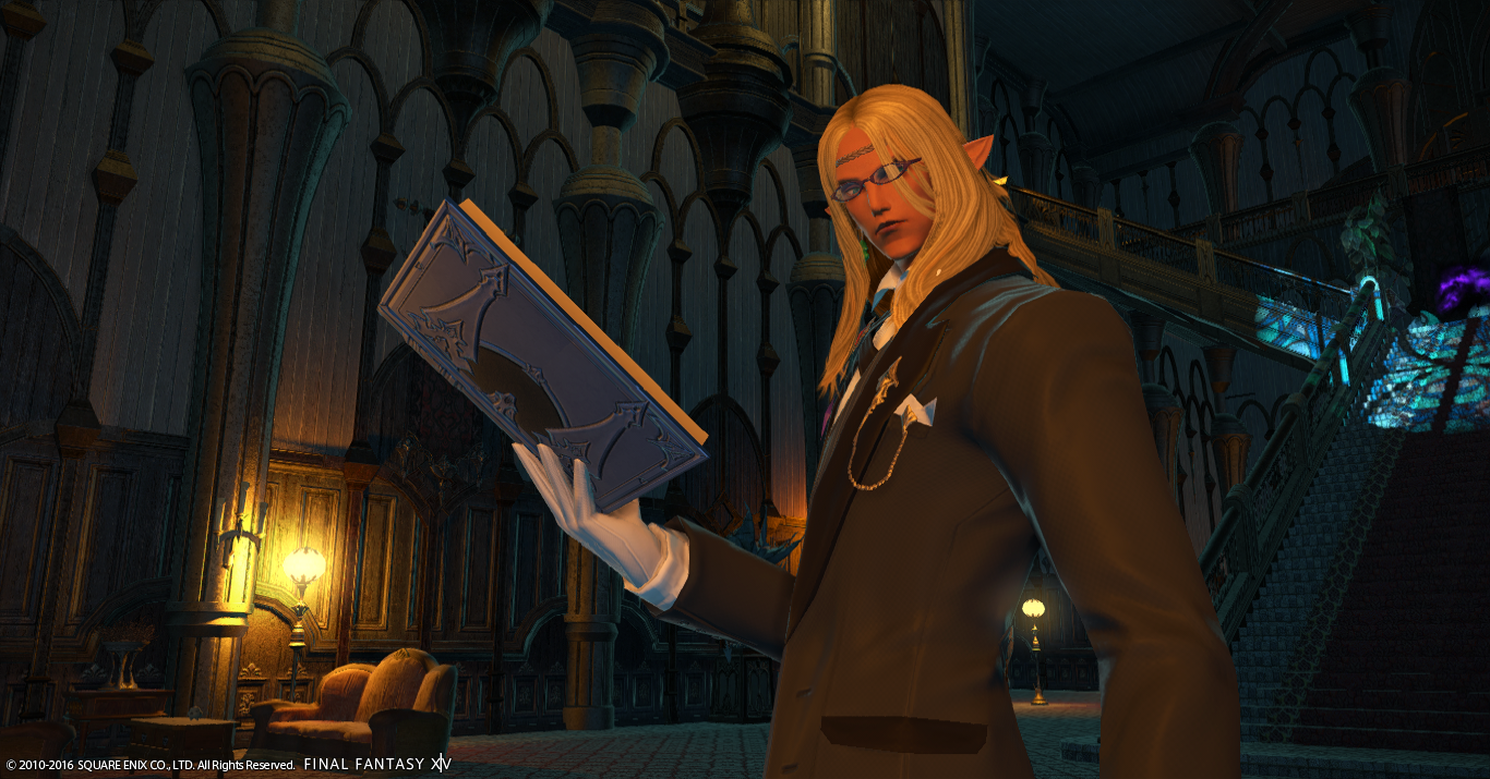
Bastien Felicieux of Balmung:
What a wicked place for such a wicked Elezen! I must say you did such a wonderful job with your setting and background! Definitely get the wicked vibe from Haukke Manor! However, I’m not sure I’m entirely sold on your pose choice. Nothing really screams out to me “I’m wicked! Look as I dastardly do something devilish!” I suppose I just want more “wicked” from this, but regardless of that… I really do appreciate what you were going for here! Just make sure you really try to stick with the theme and it’s visible for others to see how well you can execute it. You yourself are such a beautiful Elezen and can rock any glamour shot in a heartbeat! Definitely have a keen eye for amazing angles and backgrounds.
Gangly Zilla of Cactuar:
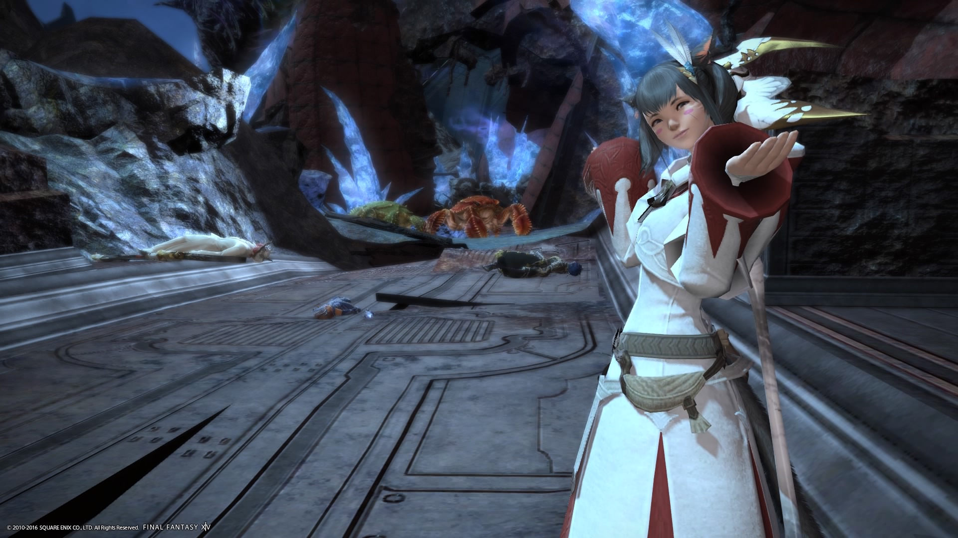
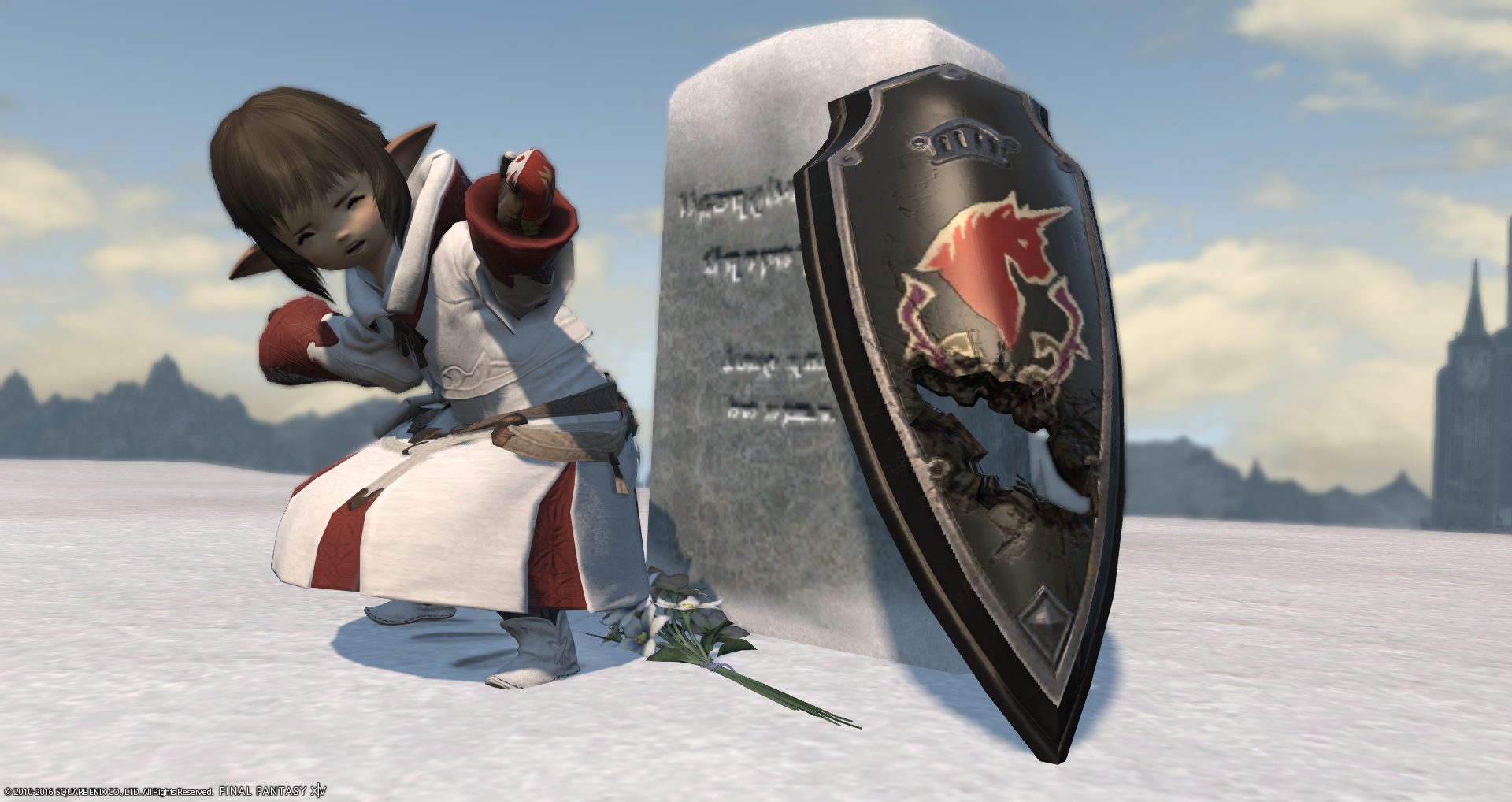
Well well well… what do we have here? Some naughty adventurers not listening to their White Mage? Not allowing you to get buffs off in time?! Well I feel like you definitely deserved that wicked moment indeed! Maybe next time they’ll be patient enough to wait for buffs! (just an fyi, this actually annoys me and I’ve wanted to be wicked to people who just run off w/o my buffs lol) I absolutely love your framing, your lighting and how well you have your dead mates and the mobs that did the evil deed, in all the right places! My one concern would be I feel like the dead bodies should have been just a little closer to you. I needed to zoom-in just a lil’ bit to see what those dead, ungrateful, and impatient husks were on the ground. But over all a wonderful devilishly wicked shot!
Iris Dawnshade of Hyperion:
… … … I’m kind of speechless here… there is “wicked” then there is just down right heartbreaking cruelty! I always knew evil was in a small, tiny, and condensed package! And her name is Iris Dawnshade! I will admit I really appreciate the more comical approach to this challenge, it’s so wicked in its own right yet it definitely got out a cynical chuckle from me haha! This is definitely thinking outside the box and I really actually adore it! One of my favorites this time around. My one concern would be you are working with a very white and gorgeous background and a very white and gorgeous WHM body piece. That can easily clash and if it wasn’t for the reds in there, it could have easily just blended in right into the background. Just be sure to always be aware of not only your surroundings and angles, but what your glamours will look like in said setting. Again just splendid job!
Jester Ehrenfeld of Balmung:
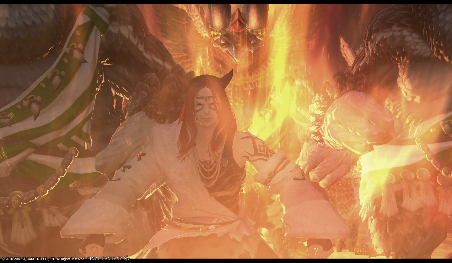
Well someone is storming up some wicked-ness with our fellow bird beastmen friends! Off to war? Punish some naughty good-doers? I really like the concept and idea, but I’m not sure the execution is on point. Special effects from cut-scenes, skills, and other effects can be such a great boon, but can also hinder greatly as well. It is just a bit fuzzy making out everything that is going on from the obscuring particle effect going on from that particular cut-scene. I really love the idea and you yourself; you definitely rocked it out with great glamour choice and expression. Just make sure to be weary of what effects if any, that you use. Make sure you are the shining star in your shots! And shine brightly!
Mackayla Lane of Balmung:
What a fiery explosion of wickedness! I absolutely adore this shot so much! It’s so technically well done, and just so beautiful. You pop out so nicely against your effect from the furniture, as well as your glamour and posing is definitely on point. I feel like my biggest gripe and concern with this particular shot is that the Bahamut statue feels very out of place. I feel like either you should have been a bit more behind it or possibly even in-front of it and still achieve the same effect you got here. But overall minus that, just such a wonderfully wicked and fire-tastic shot! You make even Dalamud look dull!
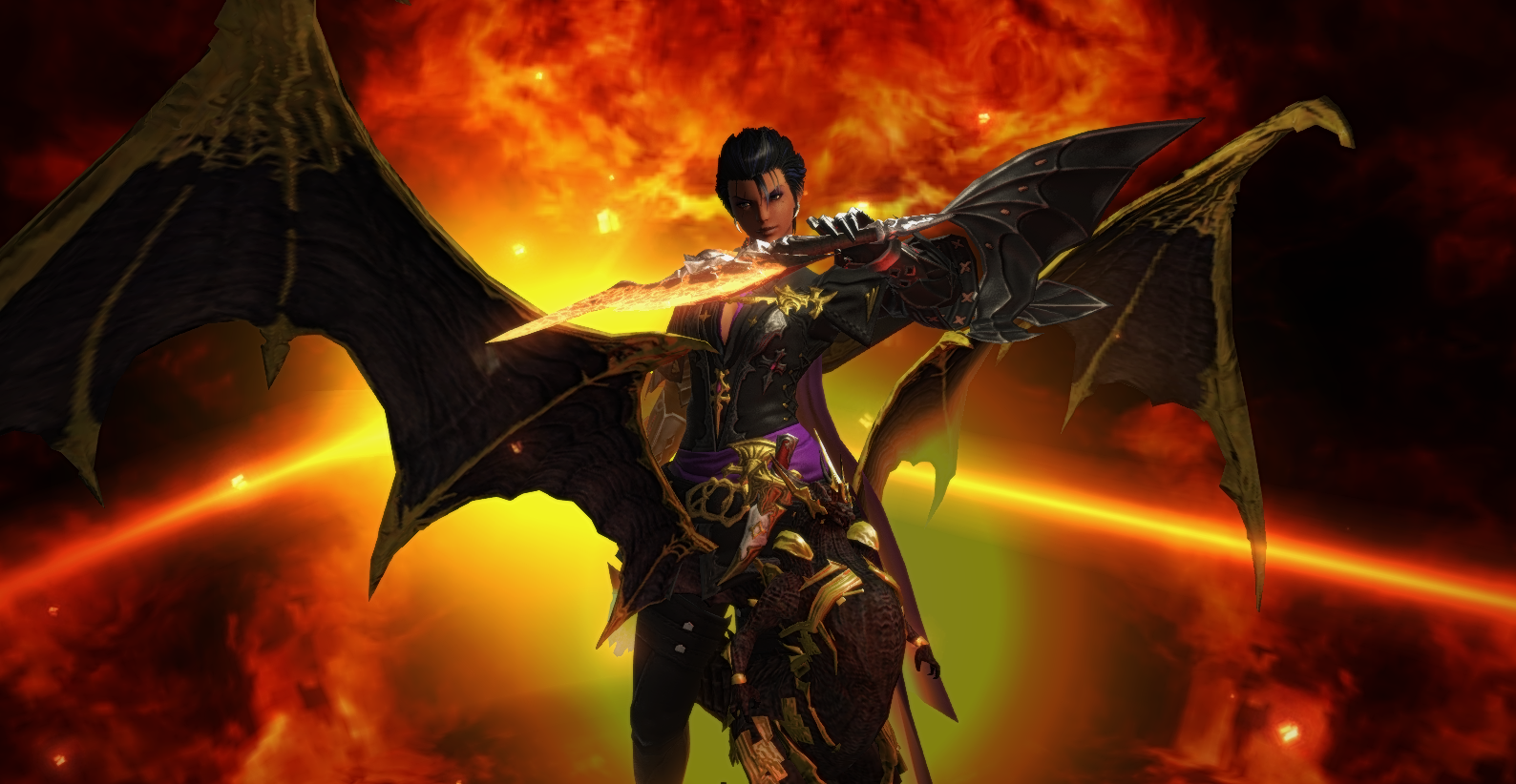
Nadede Lasalle of Hyperion:
Wow, what a wonderful use of the wickedly evil Ultima weapon and Praetorium! I really love what is going on here, as if you’re giving who ever might be at the other end of your sight the option to stay a goody-two-shoes or join the wicked side of Nadede and Ultima! My main concern with your shot would be your hair color choice against such a dark background as well as being a dead centered shot with your current angle. The hair isn’t such a big deal this time around, but paired with dark glamours and even a dark background can easily just blend in all too well. Thankfully your amazing glamours saving grace is definitely being against the fire and other brighter parts of the background. I personally love dead centered shots done well, and this one is definitely on the more well aspect, just be careful because it conflicts a little bit with your overall screenshot and Ultima’s direction. But overall such a wonderfully wicked and evil shot! Keep up the naughty and devilish work!
Shayera Tano of Faerie:
Such a spikey and wickedly done shot! I really love the background and even the residual effect coming off of your Ravana bird. The outfit as a whole really works in your favor as well as the pose. I feel my only thing to address here is that you feel just a little too centered and I’m not entirely sure it works with your pose and angle. The headwear is just a bit concerning I’d love to see your eyes and how wickedly they had shone! But it’s not too big of a hit and miss, and it definitely compliments your outfit entirely. Just be careful of repeated covering of your face in future shots. Overall really love the idea, concept and overall execution! Can’t wait to see what other wicked ideas you have to show us!
Eldaena:
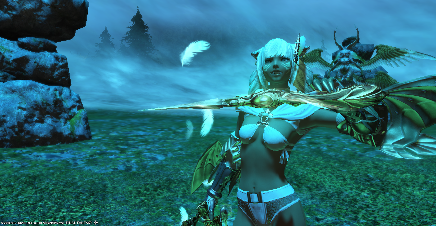
Poppy Milkweed – What a huge improvement from last week! (In my opinion.) I’m loving this shot. I can’t think of anyone more wicked than Garuda and you portray a minion of hers flawlessly. Never have those Miqo’te teeth and that crazed-eye look worked to the advantage of the model in this way. I love this – staging, lighting, expression, great work!
Caimura Rathe – I think you did great last week, and your streak continues. The background just keeps you as the center of attention, and this grin of yours also just gives me the vibe of a wicked person. (Maybe that’s just all Lalafell in general =p) The blue lipstick pops with your eyes against the darkness, which is also awesome. Location, pose, expression, – all great, keep up the trend!
Sangriah Valere – You dropped down in my scoring slightly since last week. I still love your picture though! It was just a really tough round this time. I like the theme, your posing and lighting is good. It’s mostly my personal preference, but I like to see faces a bit better in the modeling competitions, but this is still a good shot. I’d like to add that this is a good example of using an extra, but that extra not stealing your thunder. See you next week!
Kimberlynne Highwind – You raised up since my scoring last week. I like this shot a lot better and your background/pose helps draw the viewer into you, somewhat similarly to Caimura’s shot this week. What I think you could have done more is further emphasize your wickedness. From this shot you COULD be wicked, but as a viewer, I don’t fully get that. I think messing with your angles and where your character is looking could make this pose even better. Keep on improving!
Katarh Mest – Hey Kat! I did like your shot this week, but compared to some of the other shots, it wasn’t as grabbing. You’re actually at the same scoring as you were last week for me. Just as someone viewing the image, I couldn’t gather that you were wicked. I like the effects, even the little particle to the right looks nice, but there were just other shots that were a bit more wicked/attention-grabbing. Keep at it, and we’ll see you next week!
Lior Xanthos – This is a pretty good concept, but I feel like your extra is stealing the show from you here. She isn’t doing anything interesting, but I think you against a dark background, in dark clothing…I just end up focusing on her. I think the background you chose is also highlighting her a bit. Maybe another idea could have been you in the foreground, but looking back towards her instead? Your character’s face looks really cool, and taking advantage of that with a closer shot would have be neat.
Masha:
Caimura Rathe of Balmung
Great use of background. The lines draw focus onto you and lead through the entire picture nicely. The pose and facial expression is just wonderfully on point. Oddly enough, with all the evil and darkness floating about that’s a bit of the trouble I had with your picture. The lighting and your dark clothing and hair make you tread a very thin line of blending in too much. A different chest piece could also have served well here, because with the crystals leading to the centre of the picture (your non-existent lalafellian chest :P) the eyes either move upward or downward. And the light patch on your stomach draws more attention through the contrast it provides, distracting from your great expression.
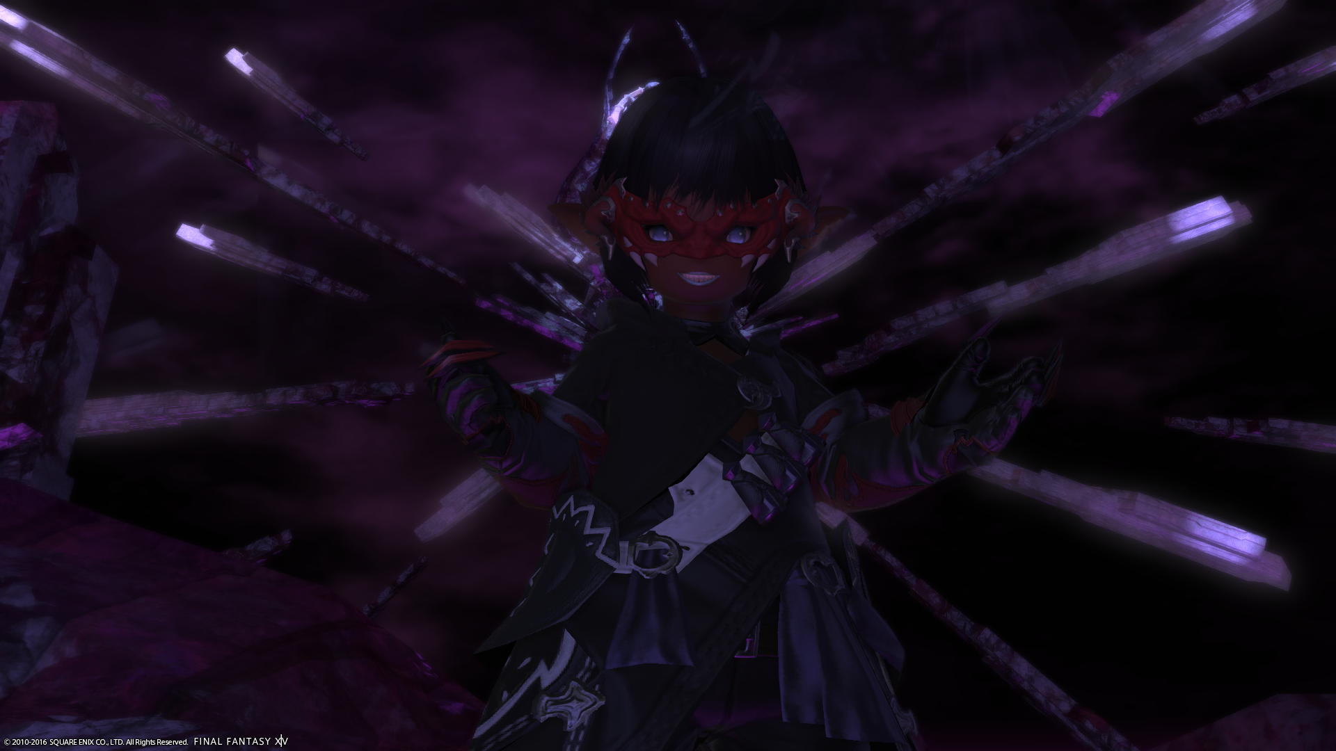
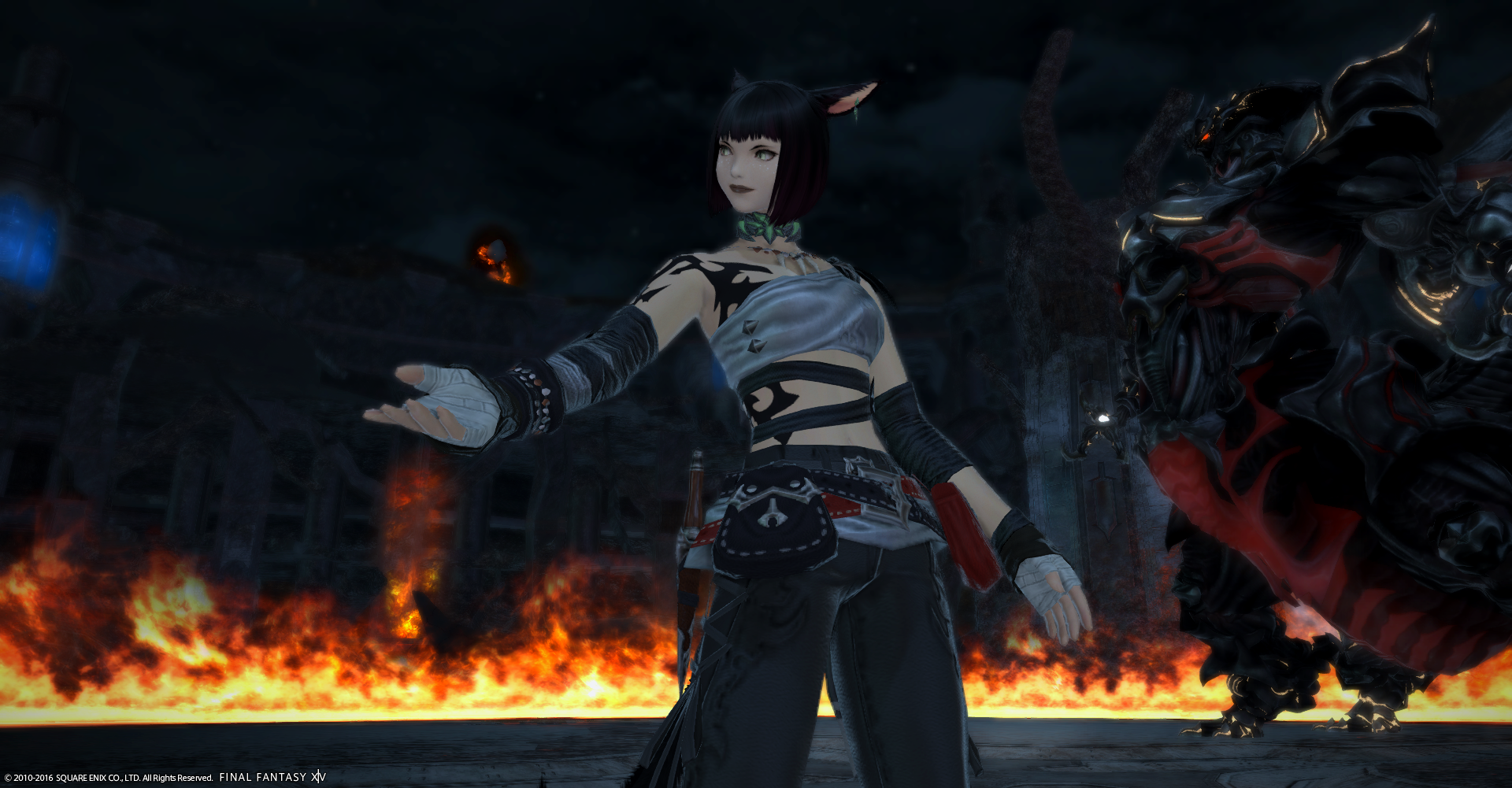
Katarh Mest of Lamia
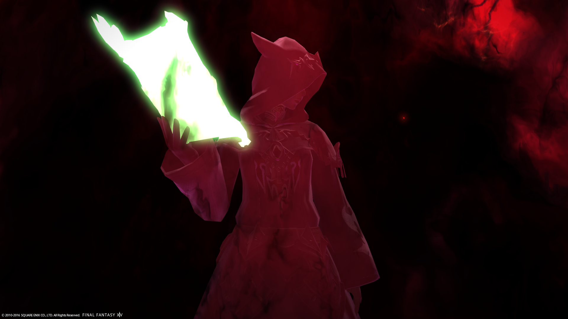
Some would call it simplistic or you too obscured, but I call it minimalist and decidedly on point. You are the focus; you are probably as close to an accurate depiction of an Ascian as it can get. Everything works exceedingly well in your favour here. The only nit-pick I’d have is that your pose might be a little bland. I could see a Black Mage work really well in this setup, because /victorypose is such a deliciously evil chuckle, I’m surprised no one used it in this round.
Kimberlynne Highwind of Malboro
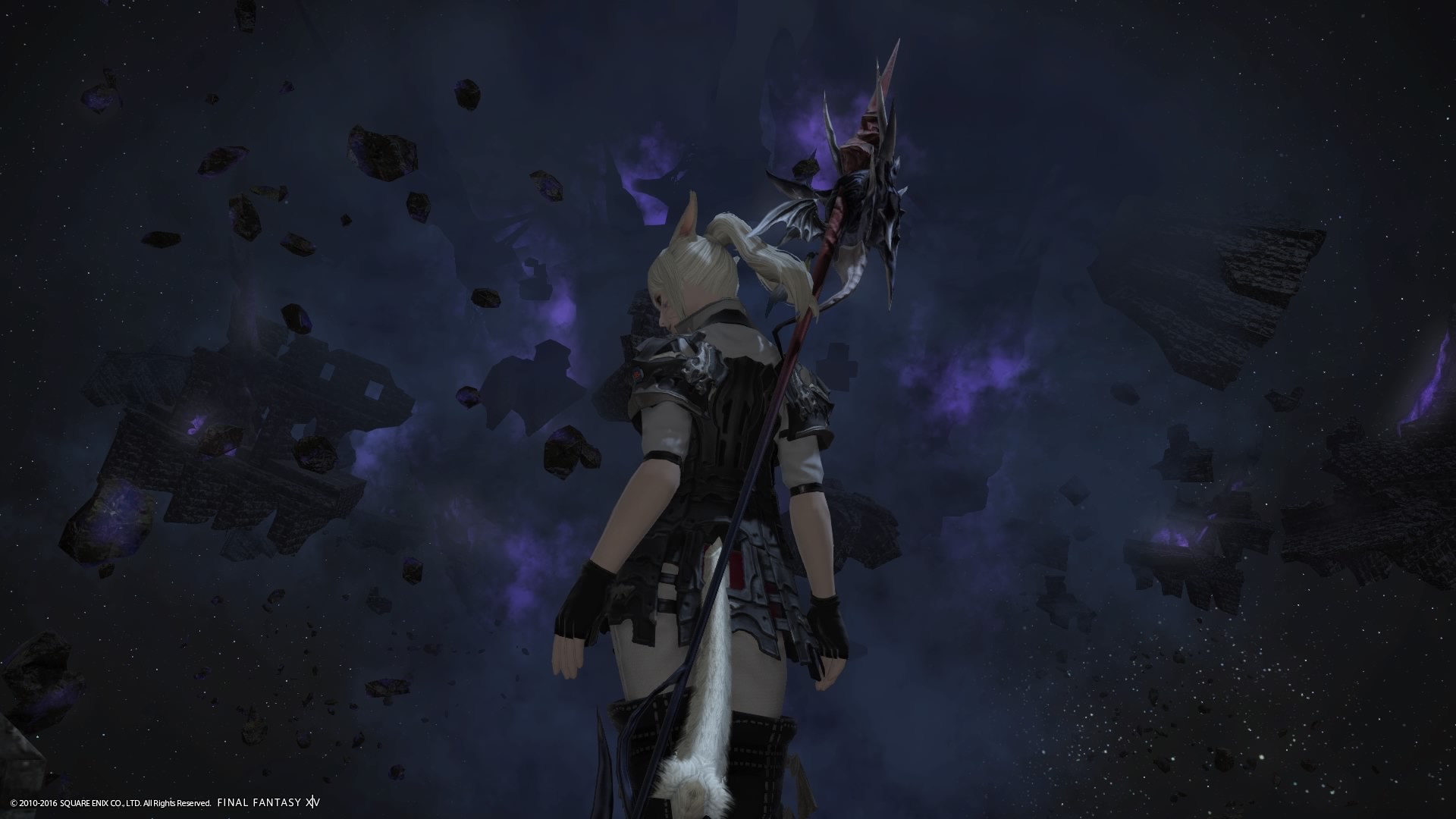
This is a very nice picture. Your bright colours are in stark contrast to your background, your pose is great and as a whole, the picture works incredibly well. BUT – and this is a huge but: Yours is one of the 4 pictures this round I felt missed the point of the brief somewhat. What I see here when I look at this and drawing common associations with what the colours tell me, what I know of your job as dragoon and the place in the background – Aery – is a brave Dragoon going for some kicking ass and taking names. Nidhogg’s specifically. Again, this is a great picture, but none of the things great about it – pose, colours, imagery – spell “I am evil/bad/wicked” to me, so as an entry for this round, it automatically loses a lot of points for missing the brief.
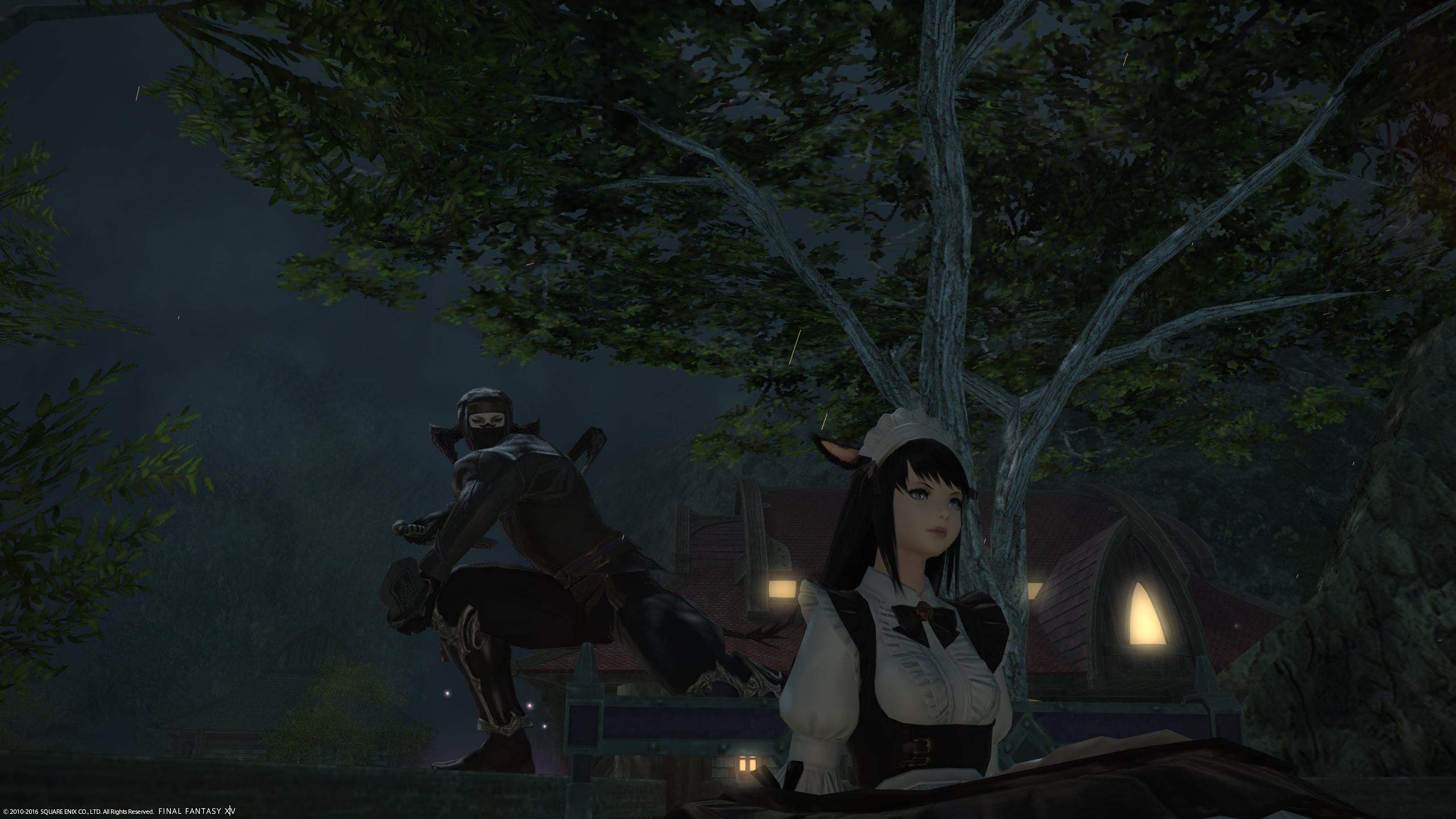
Lior Xanthos of Gilgamesh
I was really conflicted about this one. The idea is great and for the most part it is well executed. The main trouble I have here is that with it being night and the extra wearing the maid costume, it has the largest bright areas in the picture and will automatically draw the eye more than you do. One the one hand that’s good for an assassin – blending in with their surroundings – on the other it’s bad for you as a model and supposed focus of the picture. I’m not sure how it could be alleviated in this kind of composition. One possibility would be shifting the Maid into a profile perhaps and you a bit more to the left, so you are more directly framed by the trees above and to the left, and by the house to the right (you’re more covering it up than being framed by it atm).
Poppy Milkweed of Cactuar
whispers “Now fall.”
Fantastic expression that fits one of my favourite Primals. I also love the feather effect of the fancy daggers, it’s such an odd soft contrast to the crazy face you are making. Two big upsets I have with this picture though. One, it is incredibly unbalanced. Everything left of the centre feels pretty void. You’re also covering up your counterpoint, Garuda. Ideally I’d flip you entirely onto the left side, so the space is used a bit more equally. Second, the subligar. ._. That’s such an infamous garment it automatically draws the eye – and in the rarest occasions do I want to stare at someone else’s crotch as focal point of a picture. I feel there are a lot of bikini-esque bottoms that could have done the job just as well here…
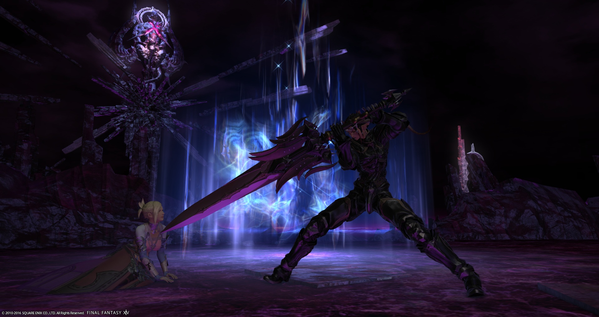
Sangriah Valere of Excalibur
Really nice idea and execution. (I cannot be the only one thinking “please make the sword slip upwards a bit, then we’re done with her”.) I do wish the image was shifted slightly to the left, because the right side feels a little empty, and more of Zodiark’s crystals would be on the left. The portal is also something I am a little conflicted over, because while it serves as a vital source of light and stops you from blending with your background, I often feel they take a little out of the immersion of a picture.