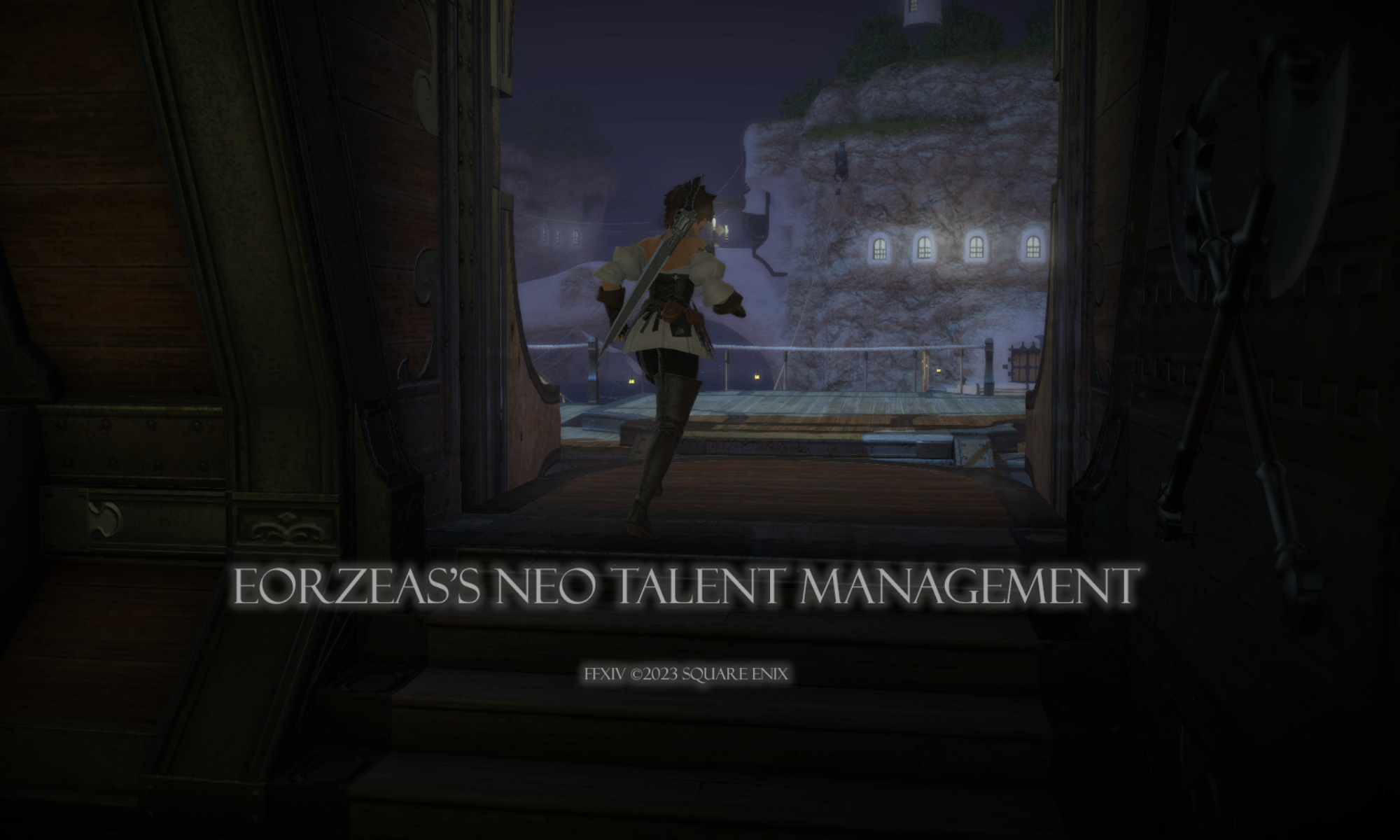
Round 3 Theme: Double Trouble
Winner: Zetsumei Tsunarashi
Critiques
Rongi
Samuru Lantis Welcome back Samuru! I was so happy to see your do a landscape shot in Week 2! Thank you so much! You framed your background wonderfully last week. Very Post Card-like! Your strongest image so far! I can’t say the same thing this week. Your background is an afterthought to an otherwise strong image. I love the way you are dead center, and your friend is at your shoulder. Very great battle pose. I would have loved to see it framed though with the background. So for next week take as much consideration as you did for your position and pose this week and your background for last week and merge them into a powerful image! Good luck!!
Destiney Delvanguard Hey Destiney! Welcome back! I loved the simplicity of your shot last week! Just a nice glamour, a nice pose, and a nice background. I thought it was very smart to focus on a different part of the city. I went into this week’s round thinking “Okay, We’ve seen simple, we’ve seen crazy, and we’ve seen simple again, so I hope Destiney blow us out of the water next week!” and you totally did! I love that you put thought into both you and your partner’s glamours. I love the background choice as well. This is definitely your strongest image to date. I would have preferred sunny weather or a starry night instead of cloudy weather though! Haha. Great job this week. For next week I hope you continue with this level of thoughtfulness towards your pictures. Good luck!!
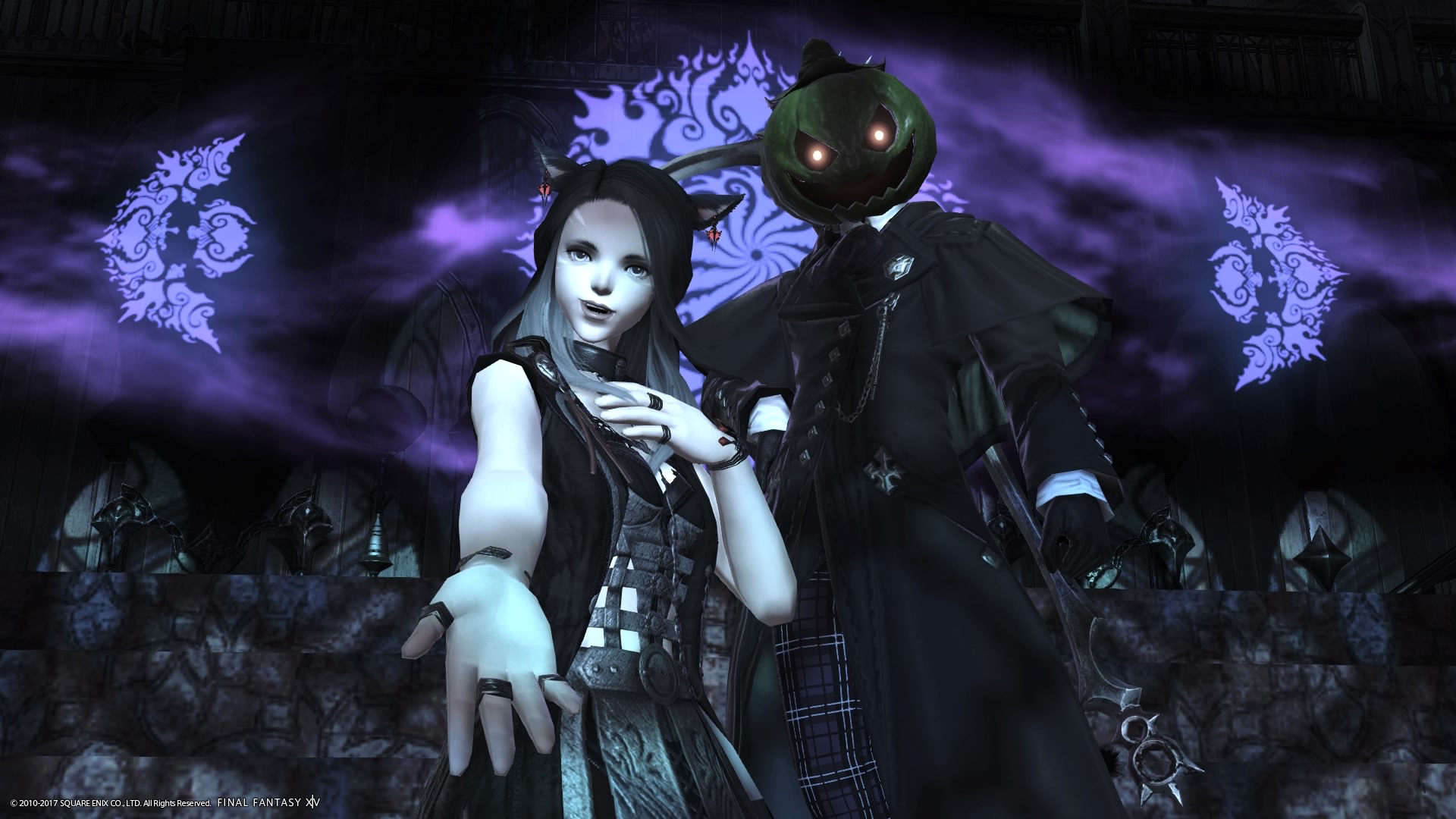
Gangly Zilla Gangly you changed your hair! Haha. I loved your shot last week. It was perfectly framed and lit and the glamour was on point. The only reason I didn’t rank you first (same as Amelia) is that I got movie instead of post card. But you were in my top 4! Two weeks in row of being in the top! How did you measure up this week? Really good! Another Top 4 spot from me. I love that you used the current holiday to theme your photoshoot. I love the pumpkin head grinning to your left. I love your glamour, I love your mischievous smile. If a model is going to do a centered shot, this is how I like it to be done. Both sides are completely the same. But what I love about yours is, it isn’t centered on you or your partner. You guys are just off center that gives this shot a satisfying feeling to look at. I love it. My challenge for you next week is simply to keep it up!!!
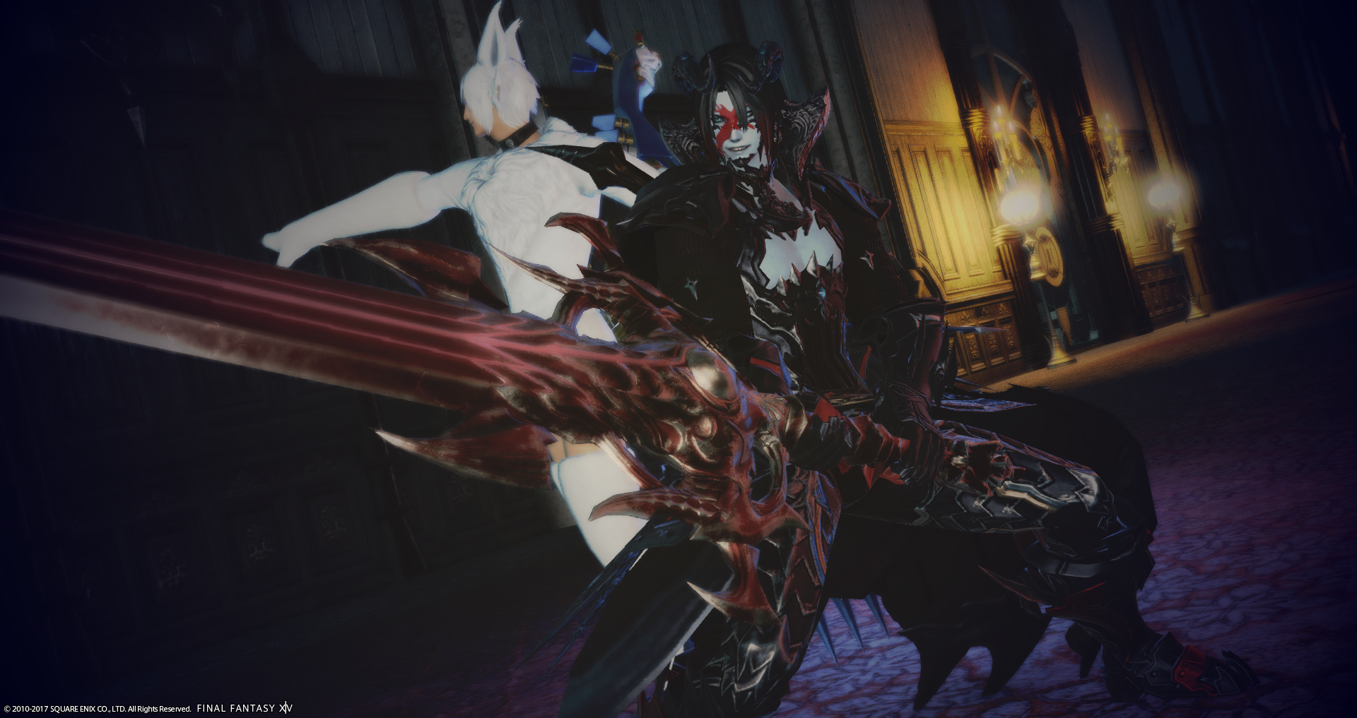
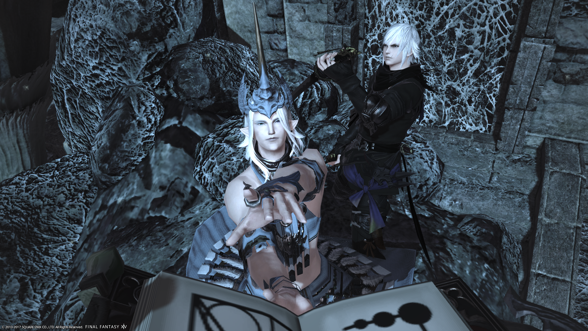
Leviathan Seagreen Welcome back Leviathan! Thank you thank you thank you for submitting a peaceful scenic shot last week! It was such a difference from your battle shots, and it blew me away! Absolutely lovely. This week you went back to your warrior ways, and it worked out so great! I love the black and white contrast you and your partner have. I can’t tell exactly what your partner is doing though. That is a little distracting. Also his outfit is really random compared to your battle gear. I love the depth we get from your background and the lighting is superb (as was last week’s photo!). I think your partner really cost you a top spot this round. It’s important to remember, even though we love and appreciate our friends for helping us with these shots, it’s our neck on the line and to take charge when it comes to directing them in the shots. This is still a top 5 shot though for me absolutely! My challenge to you next week is to keep taking great shots! Just watch out for the little details. Good luck!
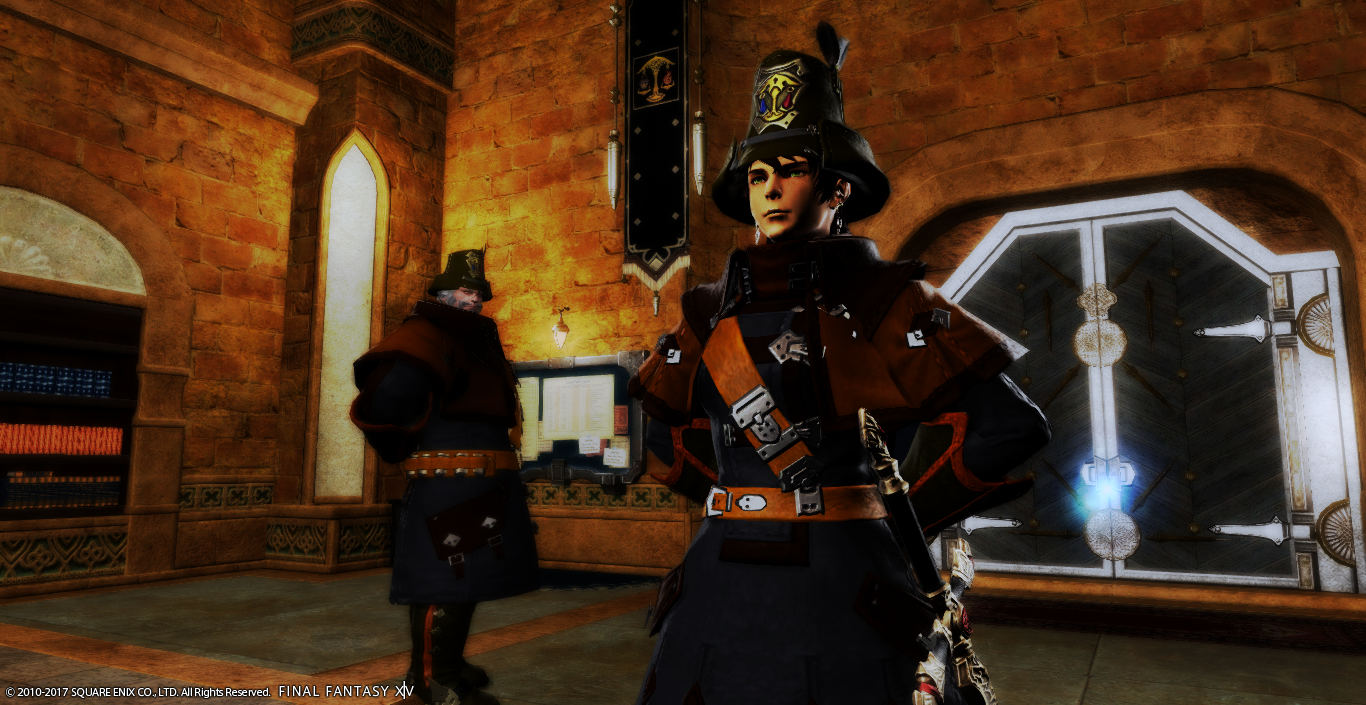
Linmei Quan Welcome back Linmei! I really appreciated that you wore some Asian-esque glamour for the shot last week to show your character as a tourist in this new land. I liked the Asian-esque frame as well! I loved the stair steps that the buildings created in the background. What I really want you to work on, and I kind of mentioned it in week 1, is your lighting! You were just so orange last week! The background looked stunning though. Moving on to this week, I was so proud to see you tilt the camera a bit, and give us that long look down the hallway. Gorgeous! I love the outfit and the pose. This week you played with the lighting and it’s your best yet! The purple really sets the mood for the shot. I love it. Youre getting better with each round, so I am excited to see what you do next week. My personal challenge, more like a request really, is that I want a close up shot of you. If you can get it to work with the round, I would love to see your character close up. Use that blue tattoo on your face as a fashion accessory and blow me away! Good luck!!!
Katarh
Samuru Lantis – I love all the seasonally appropriate shots this week, and yours is no exception. Your partner neither adds nor detracts to this shot, however, and it doesn’t really seem to be telling a story. Your character is dead center, which can work when you’re’ going for symmetry or a special effect, but the way the book is getting cut off is rather off putting to me. The background choice also seems oddly bland and doesn’t really add anything to the picture. I do like your outfit decisions – your ninja friend looks very ninja-like, and you pull off the classic summoner look very well!
Destiney Delvanguard – What a cute concept – and a cute couple dancing! Great location, great outfit choices, and great poses. This perfectly matches the theme and together you tell a complete story. I kind of wish I could see your partner’s face, but it also adds an aura of mystery. About the only thing I would have asked for improvement on this was the weather. It appears to be gloomy, and the resulting light is rather dull. A few spot lights can brighten that up. Otherwise the compsition on this is spot on.
Gangly Zilla – Tis the season to BOO! Great concept and solid execution throughout. The composition on this is nicely symmetrical, with a good usage of the location for the backdrop. Your outfit choice is ok but something maybe a little spookier would have gone well, too. I love your expression!
Leviathan Seagreen – This is a nice concept, but several other folks going for the same idea, you have to make sure that you stand out. Your partner is there, but doesn’t really seem to be adding anything to the story that you wouldn’t alone. (I love your outfit though. Go DRK!) The usage of the cam tilt is appropriate here, but I would like to see more thought put into the background and pose choices … the image is almost entirely sword and your partner is partially hidden. I do like the lighting effects, and the contrast of the yellow lights against the gloomy background.
Linmei Quan +10 for giving me Hien —- just kidding. (I do <3 him though.) I like the usage of a NON-spooky partner NPC for your spooky concept. Fantastic use of the lighting effects within the Doman Enclave, too. Your composition is complete, as it follows the rule of thirds and also makes sure that you are the center of attention by giving us the front face while your NPC is profiled. The only ding mark I have is that your NPC selection ensured he could not have any reaction to your scaring…. although maybe nothing phases him!
Nads and Vaughn did Nicol Grunenberg M’telihgo Feilyon Amelia Amber Zetsumei Tsunarashi
Nadede
Nicol Grunenberg: Eeep, I better pass inspection or I would dread what form of punishment will be handed down! The glamor that you have chosen is spot on with what you are trying to convey to the viewers. While I do like how the lighting reflects the mood of your shot and how my eyes keep going back to you after going to your Sgt., I am not too sure about the color marker filter as your choice for a color filter. It is making everything within your image appear to have a reddish to orange hue to it and thus creating a very harsh feel overall. Just remember lighting can set the mood of your shot (as well as glamour that compliments the image) as well as finding a color filter that works without being an overkill (if that makes sense). I might also suggest playing around with the depth of field some as your image last week, while good, appeared a bit on the blurry side. I will say that you have improved since week 1 and encourage you to keep up the work. Don’t forget that you can ask for feedback from past judges/contestants so that you can further improve your shots. Can’t wait to see what you come up with for next week.
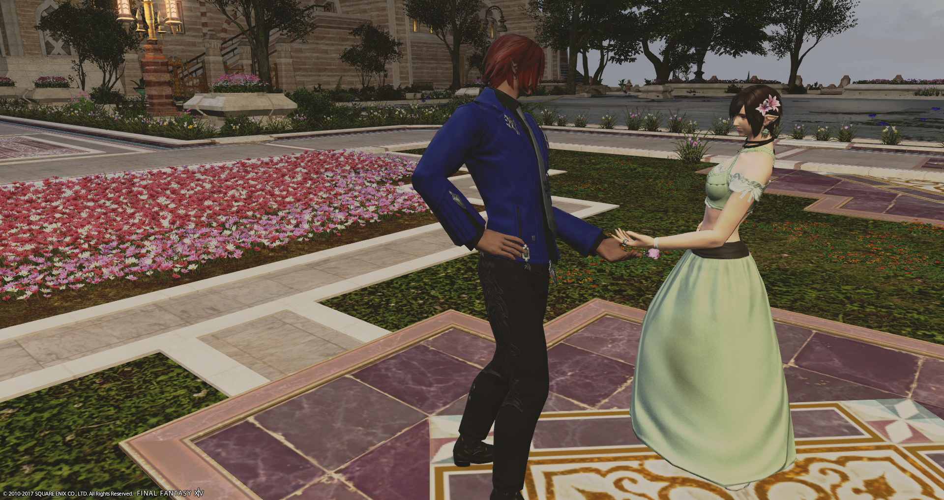
M’telihgo Feilyon: Congratulations and when is the wedding ;D . This is indeed a very lovely shot. I like how the lighting you used goes well with the overall image. I also like how the depth of field softens the lights from the windows in the background. What is throwing me off is you are right smack in the middle of the image. While being in the middle works on some shots, it doesn’t really work for a lot of others. Maybe the archway to the church could have been further to the right could have helped or perhaps you on one side of the arch and your beau on the other? There needs to be a way for the viewer’s eyes to move around the image (naturally) and come back to the focal point, you. You almost have it with the diagonal going between your beau and you but could have been extended out with the archway placed further to the right. Another thing that I would like to point out is I think I see a very slight gasp glimpse of London (or is it France I see?) with your glamour. I love that the two of you in your image are close to being color coordinated and look oh so comfy, just make sure that the angle that you shoot your image doesn’t add anything extra that one might want to keep to the imagination 🙂 . I would also like to say that I liked your image from last week and using the echo filter perfectly. I just wonder though why your right hand is slightly cut off though. Other than that, nice work that you have done so far and I encourage you to keep it up 🙂 . Looking forward to next week.
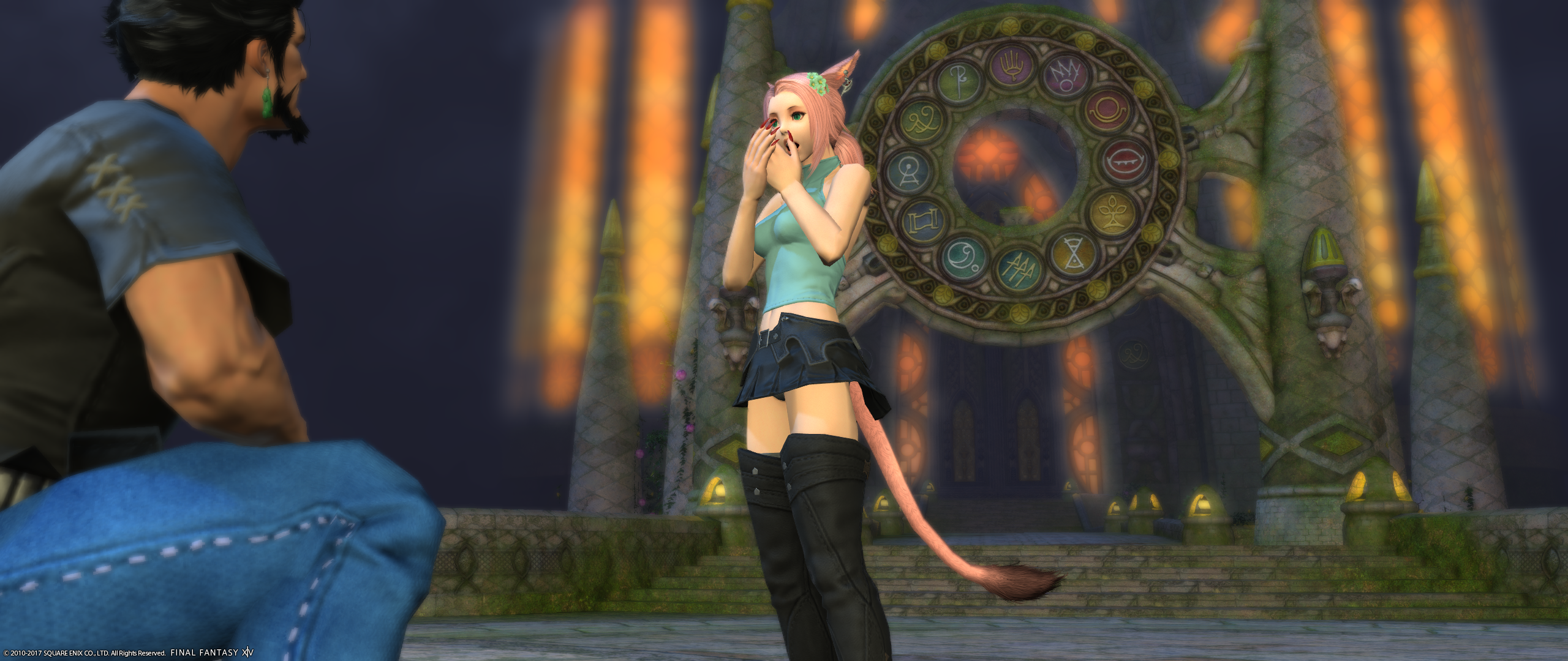
Amelia Amber: I don’t know which I would be worried first, being shot at or falling off the edge of the cliff there, even if I should be used to face planting the ground as a dragoon. I also don’t know if I would want to be in the same guild or not. I do like this thing called living, lol. The vertical shot works very well here along with the tilt added to it. The tilt adds a sense of unease to your image. The glamour here works perfectly for this image, especially since I’m thinking you belong to a guild of bounty hunters. Not 100% sure of the glasses and wonder if the glamour would work more with or without them. The lighting and depth of field that you used helps give the feel that you are in a barren land even if you had tighten the shot up (don’t worry, how you have the shot set up works well) to where you couldn’t see the background. I would also like to say I was thoroughly impressed by your Kugane shot last week. The angle, lighting, filter, etc worked, in my opinion, well for you. I have yet to be disappointed in what you have done so far this cycle and can’t wait to see how well you do next week 😀 Keep it up 😀
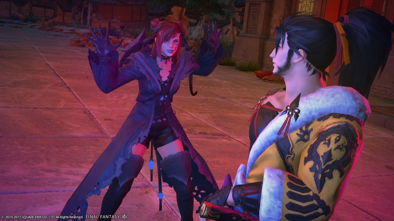
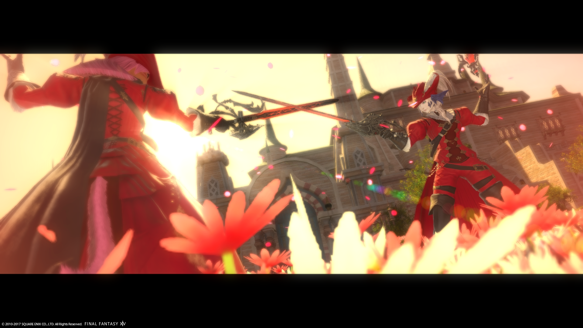
Zetsumei Tsunarashi: OMG! I am very impressed with this week’s image. This is close to how I would picture what the scenery would look like between a fight with two Red Mages. Having your fight in the flowers and using the petals effect was, in my opinion, brilliant. I mean, the first thing I think of with Red Mage is flowers or petals appearing when in a fight. The lighting is spot on and I appreciate that you have the building behind you so that we can see your face better since you are fair skinned. If you were to have the sun behind you, you would have been washed out very easily. The tilt used gives your viewer’s a sense of motion. I also like the image you had submitted last week. I will say that I appreciate that you went with something different and was one of two that didn’t give an overall shot of Kugane but instead a small glimpse of everyday life within the city itself. You are another I have yet to be disappointed in since the get go. I look forward to what you come up with and see how you might challenge yourself for the next challenge 🙂
Vaughn
Nicol Grunenburg – Very stoic and stiff, but it somehow works with what you’re trying to convey. I don’t understand the choice in filter, however. With your already straight posture, the filter should have enhanced you, not cover you in black. The placement in the shot also seems awkward to me and a little unbalanced. You’ve done better than this, so look back to what worked and what didn’t. I have high hopes for you!
M’telihgo Feilyon – A surprise proposal in front of the Sanctum! This image looks more like a scrapbook photo than a model’s shoot, but it’s still interesting. It’s difficult to stage a scene in front of the Sanctum, but I feel this could have done a great job. Your partner closer to you, the sigils between them, with the two of you on the opposite sides of it with the same poses, for example, would have made this shot much better. However, the soft colors with the filter do make this shot. I hope to see more of your A-game in the following weeks.
Amelia Amber – This is a very cute shot. I don’t think you were going for cute, though. Your partner seems threatening, but your eyes are elsewhere. You don’t seem to be taking the threat seriously, trying your best to be adorable instead. The portrait also doesn’t seem to quite work for this shot. Look back to your previous shots and the critiques. There is a gem of a shot in you. Let’s see it!
Zetsumei Tsunarashi – Oh. My. Goodness! The filters, the frame, the pose… I can’t help but immediately fall in love with this shot! The only thing is I can’t see your beautiful face, but that seems to just be how the combination made it. Great job, and hope to see more dynamic shots like this from you in the future!