For last week’s challenge, I asked our photographers to go and take a shot of a sunrise or a sunset. No filters were required this week, but they did have to be in a specific window of time (5-7 AM or PM in the game.)
We had ten beautiful shots, but there can only be one winner each round – wait, what??
TWO?? We had a tie?
That’s right! Since Scenic cycle is anonymously judged without community votes, we had a dead even score between two photographers this week. The two shots were Edge of Eternity and End of the Occupation, taken by Malkovich Malkovich and Darius Stormcrow.
Congratulations! The judges had a really tough time this week, and a tied score proves it.
For all of our photographers, please check out the critiques below the fold.
Judge Forthyn
I would like to compliment each of our photographers on the level of difficulty in casting ballots this week; everyone rose to the challenge and that effort reflected clearly in your work. Such hard decisions is what I love to experience, as that means you all are (or becoming) strong photographers, and this is only your second week! The deliberation taken towards your titles was appreciated and noted. Consider this as you read your individual critiques.
Frozen Warmth: The excellent use of focal points entertains the eye and leads your viewer through the depth of the landscape; the soft lens flare of the sun adds a gentle compliment to the cool colors as it does to the cast shadows. While there are strong blues in this piece, you also captured more neutral hues that play wonderfully with the sky; adding weight despite the emptiness. I enjoy the blended sun with the horizon. While there are some details that I would love to see more of from a closer viewpoint, the reasonable busyness does break up the snowscape.
Blood on the Sands: You went bold, and it shows. While lacking depth this shot commands for attention. The foreground is relatively empty, yet for this photo it works: the color shift of the sands is subtle and the flare picks up where the sand drops off. The color shift of the rocks is lovely, and while I am not completely onboard with the shade of the sky and sand correlating as they are, I enjoyed finding the reversed mirror-harmony between it and the ground. But consider; these two planes are dangerously close to simply sandwiching your rock cropping in a matter of color, the only thing helping to break it apart is the lens flare. Imagine how this would look should you tried creating prints.
Sahagin Sunset: Intense, vivid colors accentuated by a rich cadmium sky. The photo is without a certain focal point, but it does not stop the landscape from being playful and inviting the viewer inside. This piece would feel stronger without a lens flare: you’ve already captured a beautiful reflection upon the water, and the greens within the flare don’t communicate with those in the landscape, it is found to be moderately distracting from an enjoyable view. Do be careful of kissing edges with objects, allow them to run off the edge or keep them within the field of vision.
The Sun Melts into the Sea: The strong horizontal flow and overall weight of this photo is simplistic yet impressive. Dividing a shot down the middle isn’t a composition that is often done properly, but you’ve done it with relative success, and what makes it successful are the asymmetrical elements: clouds; reflection of the sun on the ocean; ripple-effect of the middle-ground. That said—and I understand this will sound contradictory—this piece would be more successful if there was more. The left and right planes need attention; an object of focus towards the foreground; what will make this unique and different from other horizon photographs?
Setting Sun, Rising Warmth: “Less is more,” is a good phrase to remember when dealing with busy shots such as cityscapes, as the scene quickly becomes tiring and difficult to find a focus. In this case, setting a focal point will create an area of rest for your viewer’s eyes, a moment of pause before roaming through the rest of the work before potentially coming back again. This can be attained through a blur filter and adjusting the angle of your shot slightly. I commend you on taking a challenge and going for a difficult subject, and would like to see more in the future.
A Hundred Little Suns: While I find myself conflicted over the filter from a technical standpoint, I take great delight the mood of this scene. The flowers of the foreground communicate with the glow of the sun, its radiance spreading and creating pleasant cast shadows. While the right side is relatively empty, its weight is offset by the weight of the left; an active negative space. The spires break up the predictability of the natural mountain. Though not pictured, your title lends to the imagination of ever more of these flowers being at this location, adding a level of mystic energy. Overall, a very restful and calming piece.
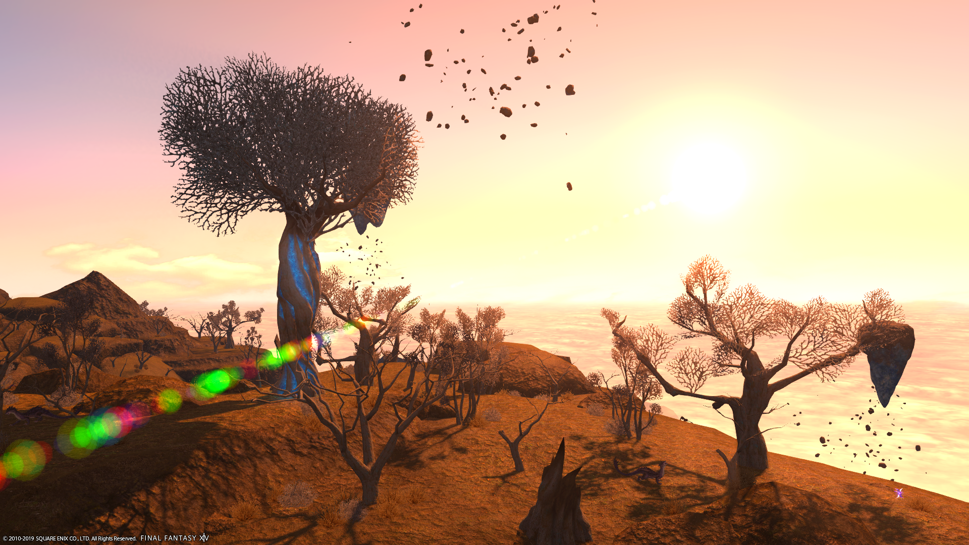
Edge of Eternity: You broke some rules, and that rule-breaking worked in your favor to create a relatively harmonious photo. The blend of colors within the sky speaks well with the clouds. The crown of the rightmost tree meets the horizon line, all but a branch, and this distracts the eyes just enough to look away from the busy left to give it attention. That rogue branch leads into the sun, which breaks off into the floating rocks, into the left panel, and back again. I am curiously bothered at the flow you established here, in a positive way. While the overall color scheme is heavily ochre for my particular tastes, the creative location and idea was planned well.
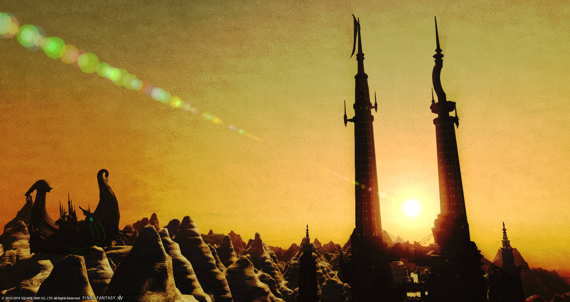
End of the Occupation: Titles are just as important as the landscape itself, it can prove pivotal in its reception. Such is the case with this. The harsh shadows casted by the sun create a level of abstractness that almost forces you to disconnect from viewing this as a landscape, and more as a symbolic honor. The sun, cradled between the towers, sets as the third tower once did; the lens flare captures the eyes into a linear decent and holds you there, at the precipice just before rapid decent. Intense visual and emotional elements are captured here and well executed.
A Dream of Painted Skies: I would like to ignore that this location was used in the previous week, but I cannot; essentially I will say that if a repeat location is to succeed, it needs to be done differently. Consider an angle from the tower itself, make it a supplement, but do not make it an offset focus. Aside from needing a different angle, the overall photo itself lacks substance. If you take away the framing and the filter, the viewer is left wanting. Honestly, please stay away from this filter. It loads your photo full of lead. I challenge you to work close, get in the face of the scenery you want to photograph and consider all possible angles before dedicating yourself to one beaten path.
Desert Rose: The sun is a distinct focal point dead center, and it accentuates the emptiness of the foreground versus the relative amount of depth created by the other objects in the space. Including a sunset is always a charming touch, but contemplate softer methods and angles which share the attention the sun is getting to the rest of the piece. Work with a type of viewfinder to help you discern foundational lines and leave the ground, I want you to fly (figuratively… unless your next idea proves otherwise).
Judge Ni’ko
Frozen Warmth: I love it when a challenge is taken, turned on it’s ear, and culminates into a beautiful shot. I genuinely did not expect such beauty in a wintry landscape as you’ve given us here. You’ve managed to bring so much richness to this shot; the flare brings us past the frozen bridge to the horizon, beckoning us to adventure in what would have been an otherwise monotone landscape. The lower third of the shot is abustle with landscape in contrast to the serenity of the upper third’s sky. The arch of mountains give just the right texture to break up the shot without coming across as jarring, and that solar flare is just captivating. I genuinely find it difficult to find fault with this shot. You’ve given me thrills and chills over your northern exposure. Cool.
Blood on the Sands: I expected solar hues to be a theme for this week, and your shot did not disappoint at all. It’s a visually beautiful palette of warm tones. I love how that solar flare shoots right across the shot to the lower corner, bringing a pop of color and temptation right to the horizon. However, that is where this shot starts to fall apart for me, because the shot is so dominated by an empty desert and muddy mountains that have really nothing to offer. As I’ve said before even a scenic shot such as this has a ‘model’ of sorts. In this case it becomes either the far left ridge where the sun is, or the area of sand the flare is crossing over. Neither area captivates me beyond the flare. There is genuine talent here in capturing a lovely shot, and this shot certainly did the assignment, but I get no story here. You shone bright here, but your inspiration feels a bit deserted.
Sahagin Sunset: In any other way this would have my eyes darting all over the place looking at the different clusters of coral, the rocky peaks to the left, the interesting smoothness to the right, and so on. It is such a disjointed area. But because of the sun’s placement, the flare, and the framing of the lake and landscape my eyes find themselves relaxing, and able to take in the shot for everything it is. It calms an otherwise chaotic image, and makes you wonder about how life is here with all of this color going on. There is a lot going on here, but you brought this psychedelic imagery together in one neat little package. It just took the right time of day. There’s a pot of gold at the end of this rainbow lagoon. Splendid job.
The Sun Melts Into the Sea: This is a textbook example of framing of the rule of thirds. The top third of the shot is this beautiful sunset dipping away flanked by a couple of mountainous islands. Clouds roll in hiding the sun while in turn being highlighted. The rest of the image is simple rippling waves, showing off the sun as it winks away. It is photography 101. But there is where you start to lose me. I’m not getting any story from this shot. No ships set sail, no nothing to break up the ocean a bit. It is lovely coloring, but all I see is a charming picture without motivation. You’ve an ocean of potential here, but I would recommend some time reflecting on this.
Setting Sun, Rising Warmth: I genuinely appreciate the effort in taking a typically monotone city (apologies to the Sultana) and giving it some vibrance. The little pops of color highlighted by the street’s lighting has the eyes dancing about casually, enjoying the calm mystique overtaking the city. It’s a great angle that shows off a very familiar main thoroughfare fading into the distance; I can just see these streets packed not an hour ago with the hustle and bustle of cityfolk scurrying home. There’s a calm in this shot not often felt in Ul’dah, and I love how this is conveyed. You’ve taken the challenge and turned it on its ear, much as I enjoy, as I did not expect a cityscape to dominate a shot with this theme. You really took it to the streets with this shot. Well done.
A Hundred Little Suns: I love how the sun practically bursts over the landscape, only dwarfed by the rocky pinnacle to the left. What normally would be a muddy bog of a landscape I see it coming to life as the morning sun greets it. The atmosphere invokes a chilly day in late winter, the ground defrosting, still not quite showing the floral of spring just yet. There is a lot of story here begging to be told. The only big critiques I have involve the empty upper right corner of the shot. It’s a nice contrast to the ground, however it’s a bit of a dull grey and doesn’t really feel exciting. The overall landscape feels muddy, but it is dotted by the flowers (or the hundred little suns as you put it), and is well lit by the sun so it has a nice balance. Overall the shadowyness of this shot is its weak point, but it is giving me a good story. Your efforts in bringing forth a crisp shot came off as a little bogged down.
Edge of Eternity: Breathtaking is the first word that comes to mind here. How often does this hearken back to my first time visiting the Sea of Clouds or the Churning Mists only to be entranced by the edges, wondering what is truly out there in the great beyond. This shot leaves no area bare. The colorful tree to the left, the other shorter trees dotting below, the horizon in the distance, the scatterings of rock in the midst, the sun to the right; everything about this shot is a treat to the eye. The way the sun is setting gives vibrance to the otherwise muddy ground here, and flares out in just the right area to give a little pop of color to draw the eye away from an otherwise unappealing patch of the shot. The use of thirds here is brilliant; the right hand tree seems to edge right against the horizon with a few fronds popping up in defiance. This is another shot I find difficult to find flaws in. You brought me right to the edge of my seat, and all I can see is heaven. Excellent job.
End of the Occupation: Story. Story, story, story, story. I love this shot purely for the story it invokes, regardless of whether or not you are familiar with Stormblood’s storyline. It is a powerful image, the sun setting down between the pillars, a symbol of what was, and a new symbol of what could be. The flare is dramatic here, leading your eyes right to where it belongs. The arc’s pop of color to the left attributes to the story; clearly it is a symbol of goodness here amidst the dark, sandy, muddy tones. Admittedly the filter here is a bit suspicious as it grains out the shot considerably, but given the time of day it works well. This image lacks color, but more than makes up for it in story. I column like I see ’em; you are a pillar of storytelling.
A Dream of Painted Skies: This shot is polished, and full of texture to captivate the eye. The rolling clouds to the right, the pillar slightly off-center, the lighter hues to the left, and some textbook rule of thirds action here with the water level. This is practically a watercolor painting, and I just love how it blends together. The orange and brown hues look incredible sitting atop the steely blue sea. However, a few notes. Firstly, the frame used here was simply not needed; this is an exquisite shot without that extra touch. Secondly, and this is a big one: this is practically the same shot done last week from a different angle and time of day. Now, I know it is nigh impossible to take a shot in the Ruby Sea without getting Heaven-on-High involved. I also know that this was not intentionally the same shot as it is different enough to be distinct. I also know that coincidences happen. Last week we had two pairs of accidental twins. But this is so similar to a previous shot that it takes away from the impact of this moment. I genuinely love the texture and composition here, and want to keep seeing this level from you moving forward as this is the skill that will net you victory, but the surprise was lost. There is time enough before the next week to change your idea, go with a back-up, and accept that someone simply beat you to the idea. In reaching for the Heavens-on-High your execution left me feeling torn.
Desert Rose: I did expect sunsets, and warm palettes with this challenge. You’ve given this to me in spades, and I love how the colors blend together giving great silhouettes against the setting sun. This shot is a great practice in framing as you have the tree and structure to the left flanking the setting sun. But there is where it starts to get muddled. There is a lot of plain dirt road before you with little to catch my eye beyond the dead-center sun. I am getting no story from this. Apart from the bright sunset pallette there is little to grasp my attention, and make me curious about this shot. While you rose to the occasion you’ve sadly left us parched.
Judge Ona
HELLO ALL! Last week, I was provided the feedback that my comments did not provide critiques, and was asked for clarification on them all. I will be utilizing the following format moving forward: Short poem or story that I feel from the image, then the Oreo cookie approach to feedback.
Frozen Warmth:
Anna: Oh, Elsa!
Elsa: You sacrificed yourself for me?
Anna: I love you.
If you have seen this movie then you know what happens next, if you haven’t SPOILERS the frozen land begins to melt. I have this feeling that this image was taken at the exact time of Elsa and Anna breaking that eternal freeze and setting the world right.
The soft glow of the sun peeking out from behind the mountain range added to the soft color palette of the mountains themselves creates this soft and beautiful glow to the entire image. I also love the shadows created by the bridge down in the valley.
I would caution to use too strong of a solar flare as you did here. The bright red and green are out of place with the rest of the image and pulls your eye to them and to a less interesting part of the image. I would venture to say that this image would have been stronger without the flare altogether, and that says a lot from me, because I love me some solar flares.
Last thing, I like how the image is off centered with the focal points, but not so far that it becomes distracting. The Sun, the Bridge and the subsequent cliff edges all slope downward, creating a nice line for the eye to follow. I appreciate you keeping the image details in focus, while blurring the sun and the distant mountains. It definitely adds to the soft feel of the image overall.
Blood on the Sands:
Is this the sight that Daenerys saw when waking in the Dothraki camp next to Khal Drogo? The sun rising gently over the sand and desert sky? I am not sure, but I feel that this image came straight from the Game of Thrones.
As previously stated, I am a HUGE nerd when it comes to solar flares in images. They make me genuinely happy. This one does so much to draw the eye across the image and to see the sands and the mountains. It keeps in the same color tones, as well, which adds a significant element to the image.
Unfortunately, the image does not give the viewer much to really see. The title of “Blood on the Sands” would lead me to believe that there would be a warmer red glow spilling across the yellow sands, but that red glow really only covers the one mountain. Not judging you on the name, just be careful about that. In all honesty, another bold element there on the sands, such as red sunset streaks, would have added more depth.
I do enjoy the heavy contrast of shadows and light in this image. The cliffs next to the sun are in full focus and bright enough to see all their details, while the ones farther away have this hint of mystery and shadow and the details are more obscure.
Sahagin Sunset:
I saw this image once, of Ariel, the Little Mermaid, on a rock with this gorgeous sunset painted behind her. It was epic and I wanted it, but alas, my budget did not afford for the 200$ price tag, and I refuse to bargain with people’s artwork. Anyway, I genuinely feel that Ariel could be perched on a rock in this lagoon.
I am genuinely a fan of the colors in this image, it allows the eyes to dart across the whole screen and take in all of them. It really adds depth to the image and brings balance to the reds and yellows of the sunset.
I am concerned, though, that the image as a whole is very unfocused, and it all appears very blurry. Everything kind of morphs together and it is hard to differentiate the various elements. I would also caution you to make sure “statement pieces” such as that intense rock formation, are not cut off. If you would have pulled back just a hair, the tip of that spire would fully have been in the image.
I do love the double lines you have here, from the sunsetting on the water, and from the solar flare. It really draws the eye of the viewer back to the sun, and its explosive beauty on the rock formations.
The Sun Melts into the Sea:
This image looks like it could be from my Company’s website. My boss does a lot of scenic photography and has several sunset images we use on our website and literature. I showed her, and she thought it was one of hers initially, until I told her it was from FFXIV. Then she asked too many questions about in game photography. I digress.
I love the mirroring rock formations on both sides of this dead centered shot. They add framing and support to the setting sun and help to direct the viewer back to the center of the image. The yellow glow on the water at the foreground being in focus is a nice touch adding the dimension of the water and its elements as well.
I am, however, a bit indifferent about the sun itself. Although it was *necessary* in the image, it appears “half-done” in a sense, almost an afterthought to the image as a whole. With the deep richness of the colors across the sky, I feel the sun in this image would never have been able to produce them.
However, those colors splashed on the sky are beautiful. The deep blood red of the clouds is gorgeous, and I may ask for that color when I get my nails done this evening! The fade from yellow to the deep orange-red is excellent. Finally, I love the clean horizon line and the clear contrast between sky and sea. Bold choice.
Setting Sun, Rising Warmth:
When day is done there falls a solemn hush:
The birds are silent in their humble nest.
Then comes the Master Artist with his brush,
And paints with brilliant touch the golden west.
This is a beautiful image of the city of Ul’dah immediately after the sun sets. Normally I wouldn’t enjoy an entire image of one-color scheme, but knowing the intent of the hue, to send the feeling of the warmth of the sun rising in the city, it does an amazing job.
My fear with this image, however, is that without the title, it’s just Ul’dah after sunset. It is a interesting image, but it is a lot of orange and not enough reason for the image. I wonder how this image would have looked during a sunrise instead?
What I am absolutely in love with, however, is the use of the street lamps to add dimension and focus to specific spots in the town, such as that flowering bench. The use of that lighting gives image a spot to focus on. Perhaps that was the overall goal of the image, however, I would caution you to do too much of one-color tone without a clear source for it.
A Hundred Little Suns:
Far over the misty mountains cold
To dungeons deep and caverns old
We must away ere break of day
To find our long-forgotten gold.
Transport me to the Hobbit and sing to me, Thorin Oakenshield. This image is BEA-U-TI-FUL! Stunning more like. The spires, the soft vibrance to the image, the shadows and the light touching the water are just excellently placed and I cannot get over this image…. Probably going to make it my computer background.
My only critique is that I have to pull myself away from this image to go take my own shots for Instagram Cycle 2.
I love the way that the light glints across the tops of the mountains, throwing a clear shadow to the backsides of each ridge, while the rays begin to obscure the spires to the left. The illumination of the pond *juuuustttt so* is enough to bring the viewers gaze to the rest of the photo, while this gorgeous sun pulls you back in. Brilliant job this week.
Edge of Eternity:
At distant edge of earth,
A straightened rainbow
Reaching far into the sky—
Holy shadows my love! The trees don’t even know their strength as when it is portrayed by the shadows casted by the sun! What an epic image! There are so many colors adorning that sky! The blue-purple hue of lilac into rose gold into this soft honeycomb of gold brings the image to the focal point of the bright sun itself. As I look at this image, there is so much to soak up, but the eye keeps returning to the sun.
It is difficult to discern where improvement could be made, as most of the things I would suggest are not elements you can change, i.e. the floating rocks in the sky. I would venture to say, that this image shows great planning and timing to get those colors as stunning as they are.
Again, another epic solar flare. You made Ona proud. Having it strike there, where the shadows of the large tree falls, helps to guide the viewer back to the sun and across the landscape where the effects of her beauty are transforming. Beautifully done this week!
End of the Occupation:
I saw the day lean o’er the world’s sharp edge,
And peer into night’s chasm, dark and damp.
High in his hand he held a blazing lamp,
Then dropped it, and plunged headlong down the ledge.
Well this is definitely an interesting shot. Everything is either drowned in shadow or sunlight. I love the interesting details you can see on each hill front, while losing all details on each backside. Likewise, the lights from the windows on the spires just hinting of their lighting adds a small, but interesting detail.
I would caution you with the use of your solar flare and the direction it heads. If the eye follows it, it takes the viewer away from the scene below and into the darkening colors of the sky instead. Change the angle to draw the viewer to the scene.
Finally, I do love the centering of sun between the towers. It is a bold move. I also absolutely love the color change in the sky. It is strange that almost green color at the upper top left can fade into the deep red that adorns the horizon.
A Dream of Painted Skies:
Gold are the great trees overhead,
And gold the leaf-strewn grass,
As though a cloth of gold were spread
To let a seraph pass.
And where the pageant should go by,
Meadow and wood and stream,
The world is all of lacquered gold,
Expectant as a dream.
Another week and another “painted” image. I feel a theme happening here. Maybe you’re the same person as last week??!?
I am definitely feeling the painting filter in this image. It seems like it could be a Bob Ross painting, especially with those happy little trees. I love the framing of this one, with the horizon line sloping to the sea at the bottom. It is a good setting for this.
What I don’t think works is the HoH tower. It takes away from the scenery and draws your eye to it instead of the hills and the water, and let’s be honest, HoH is cool inside, outside, it’s kind of boring. I would also caution you to use the term “painted skies” for a title, as most often that gives the expectation of many colors and hues. (This did not factor into my judging).
It was an interesting choice to use the frame you used. Is there a reason for this one in particular? I absolutely love the cloud strafe and how they each have a multifaceted color combination of those golden hues. Finally, the mountain in the background being more of a silhouette and being devoid of details really works here.
Desert Rose:
I dream of fire
those dreams are tied
to a horse that will never tire
and in the flames her shadows play
That ring around the sun is epic. It is so subtle yet just enough to bring your attention to it and the exact center of the image. The cast of the red hue does well to tie the colors of the sunset to the scene in the foreground. Everything is bathed in this red glow. It is really beautiful.
I would caution you to take notice of what is sharpened in the foreground, however, as too much focus can cause pixelization and distortion in the ground graphics. Although not too apparent here, it is still visible.
The sharpness on the sun itself is also a nice touch. It
brings the image back to it for the focus, but allows the viewer to flit around
the image to the trees, objects and other plant life throughout. Excellent use
of the rule of thirds here as well! Strong showing this week!